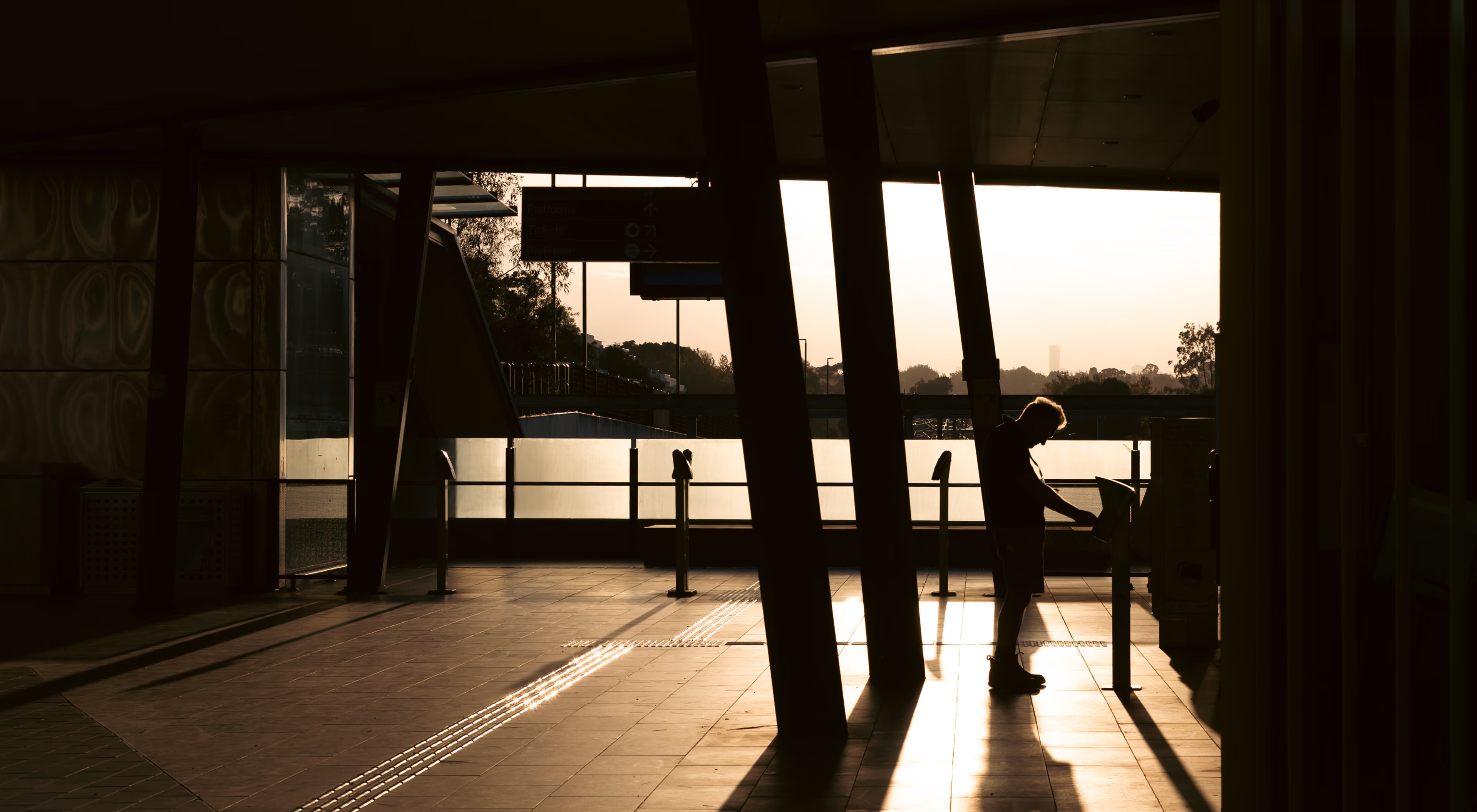
Set behind a canopy of established trees in Glen Iris, Perch by Nuterico is a collection of nine residences shaped by a quiet relationship with its leafy surroundings.
Studio Nascent was engaged to develop the creative identity and translate the character of the development into a cohesive brand experience. The established landscape became an important point of reference. Perch is not immediately revealed from the street; it is discovered through and beyond the trees. This sense of gradual discovery became the foundation for the identity.
We translated this idea through a visual language of layering, transparency and reveal, creating an experience that unfolds progressively across print and digital.
The physical collateral was designed to make discovery part of the experience.
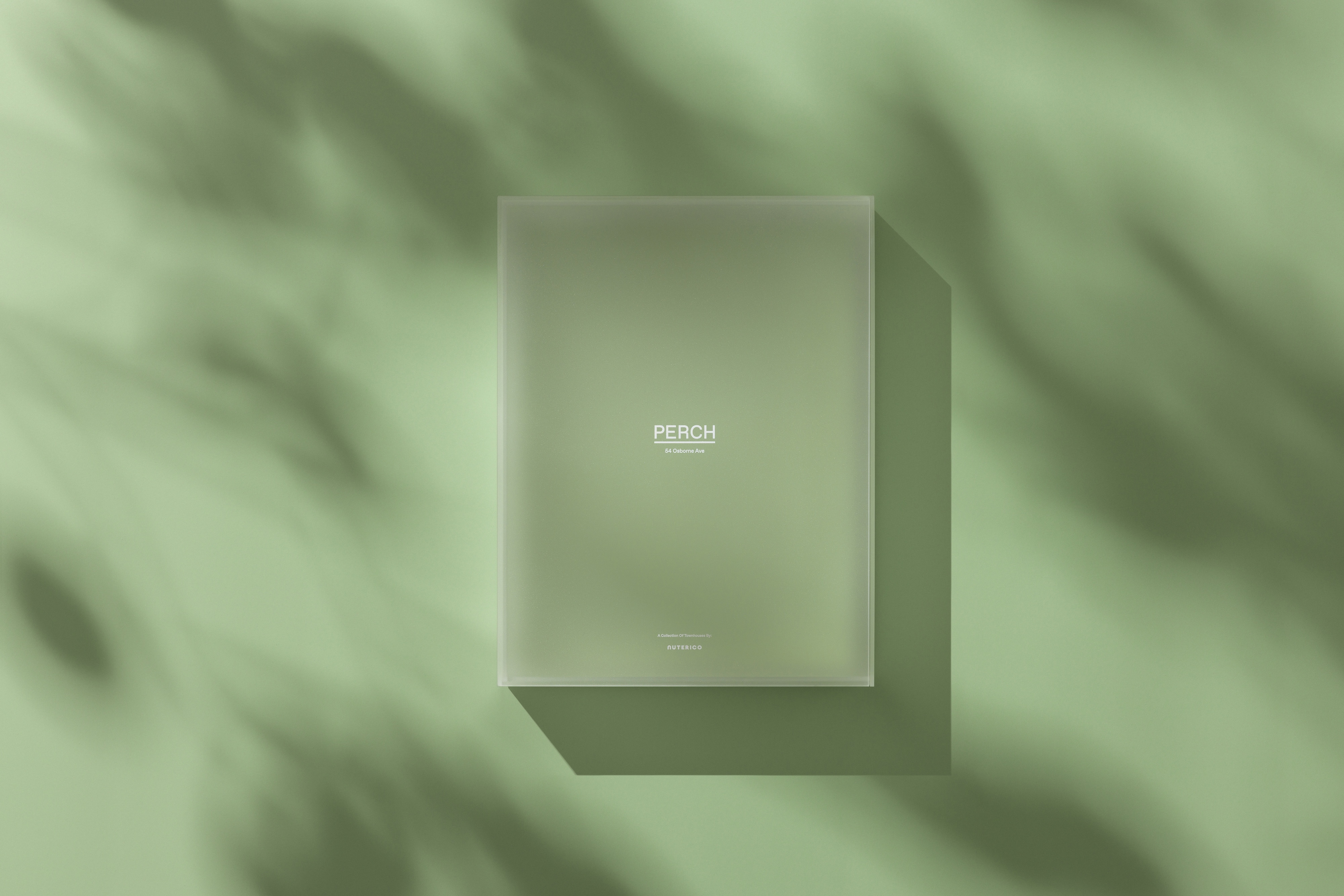
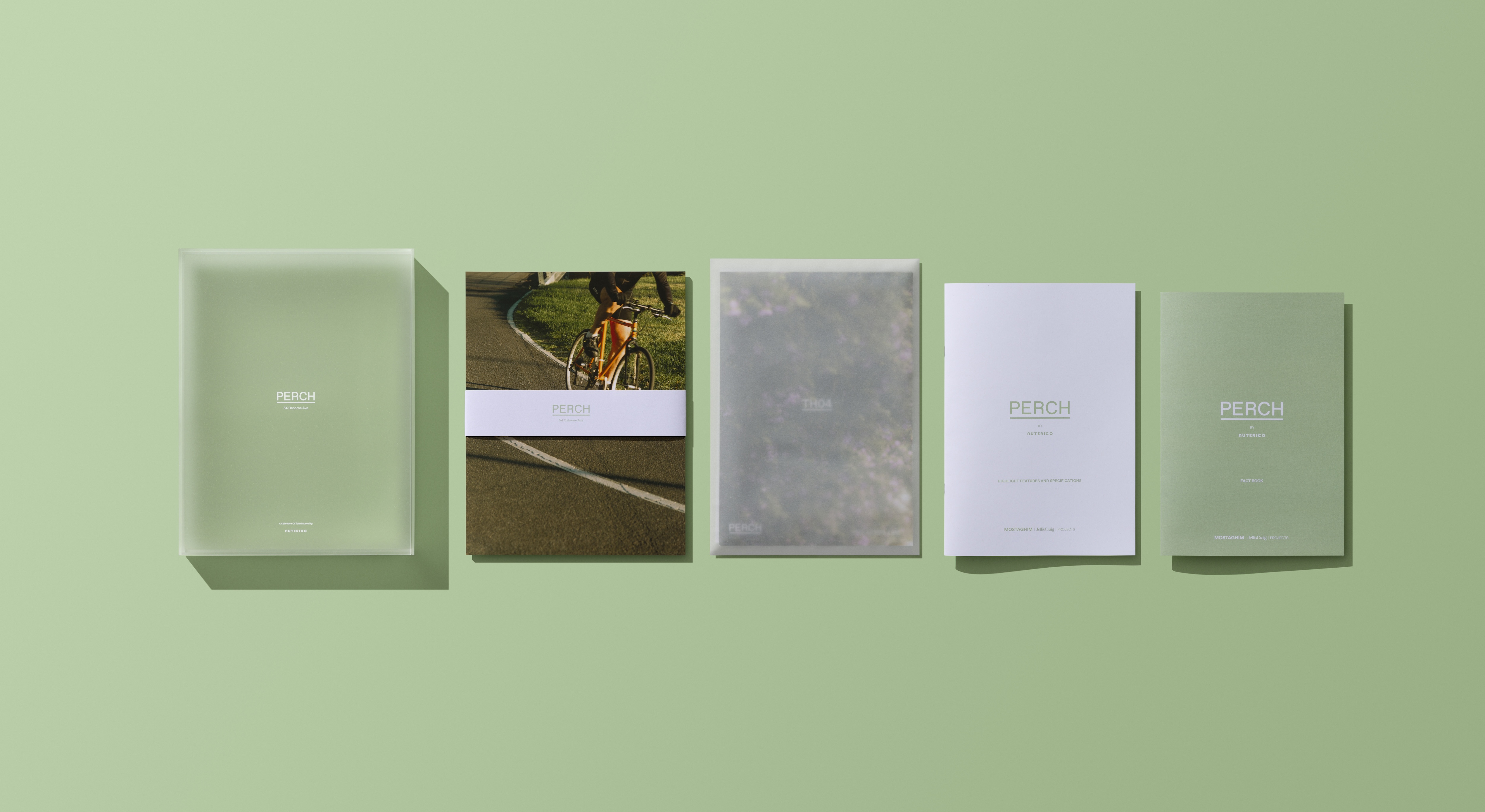
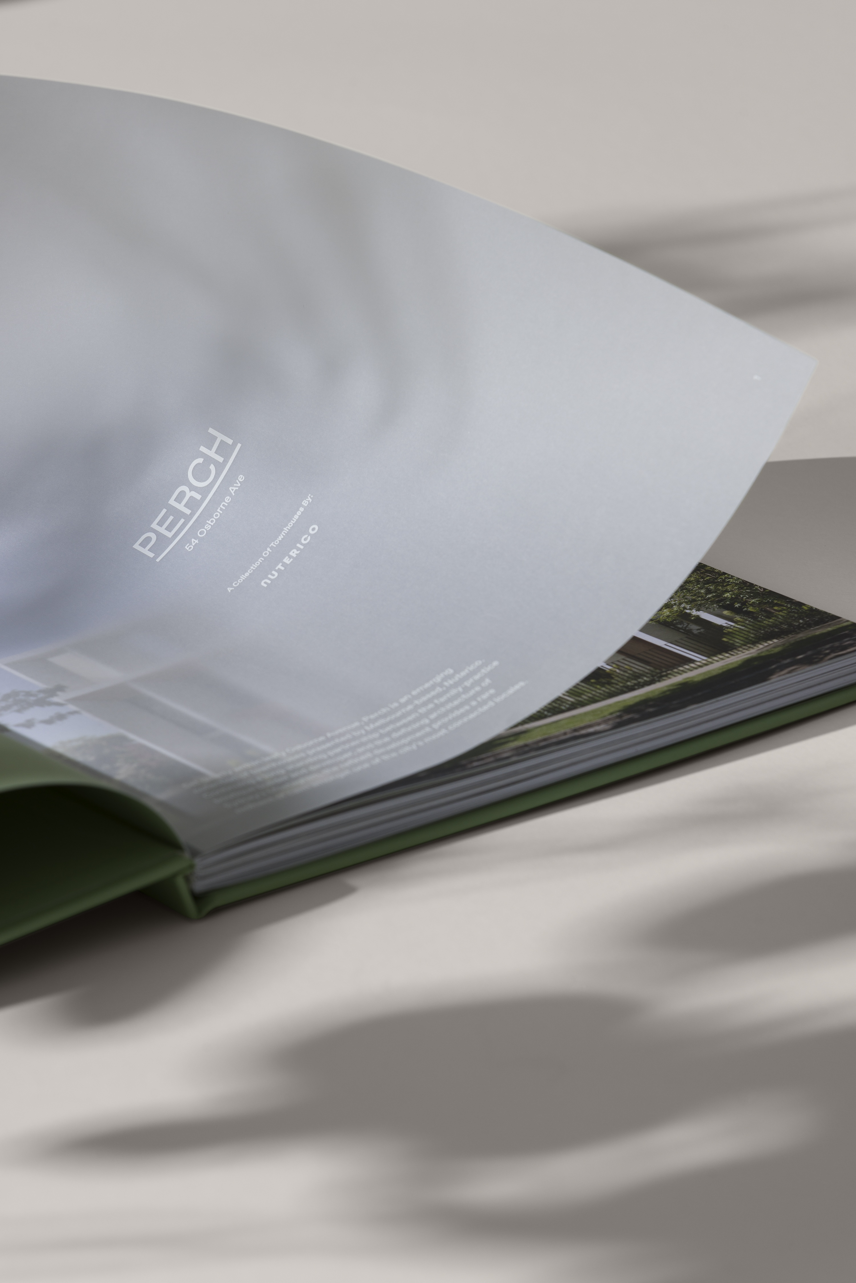
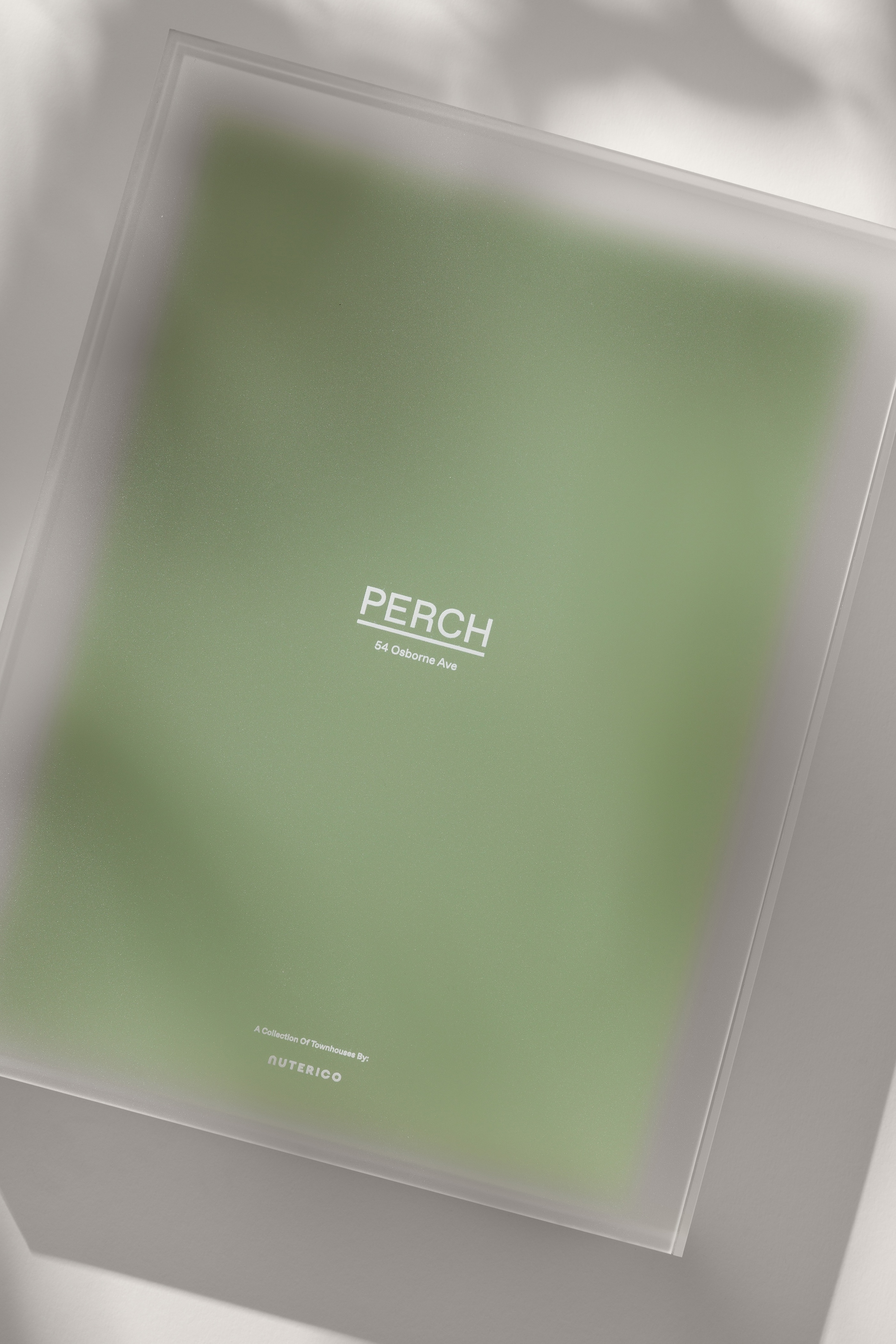
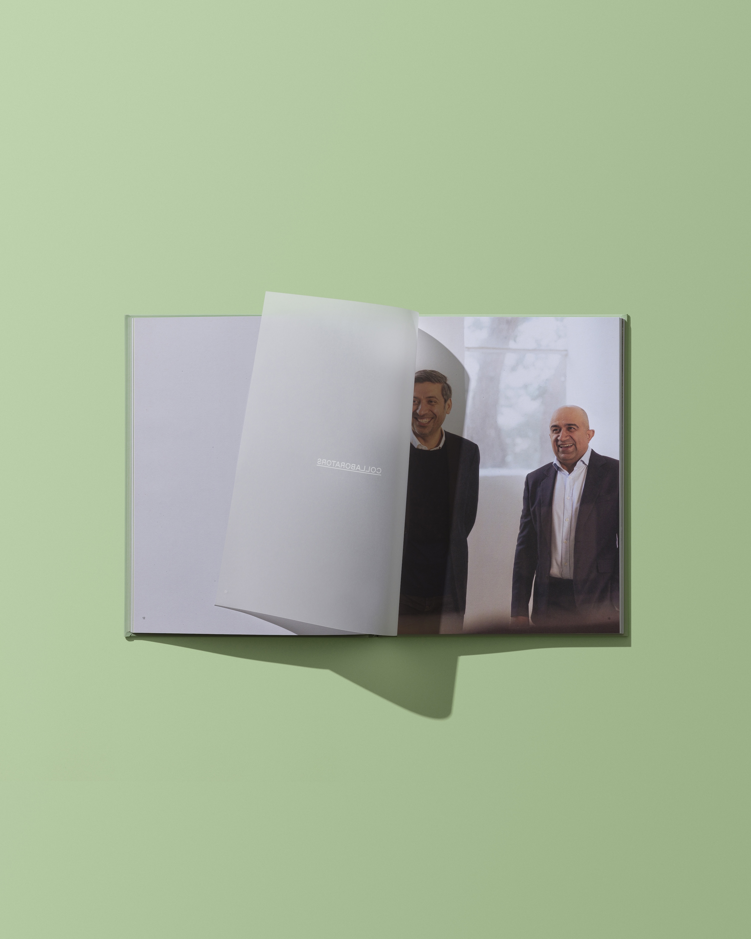
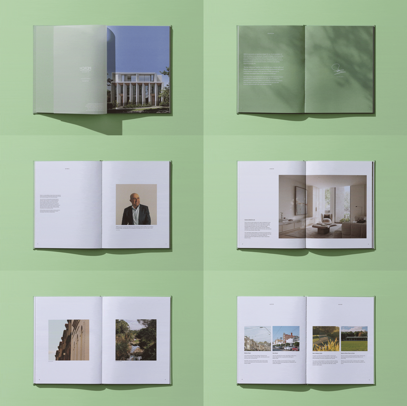
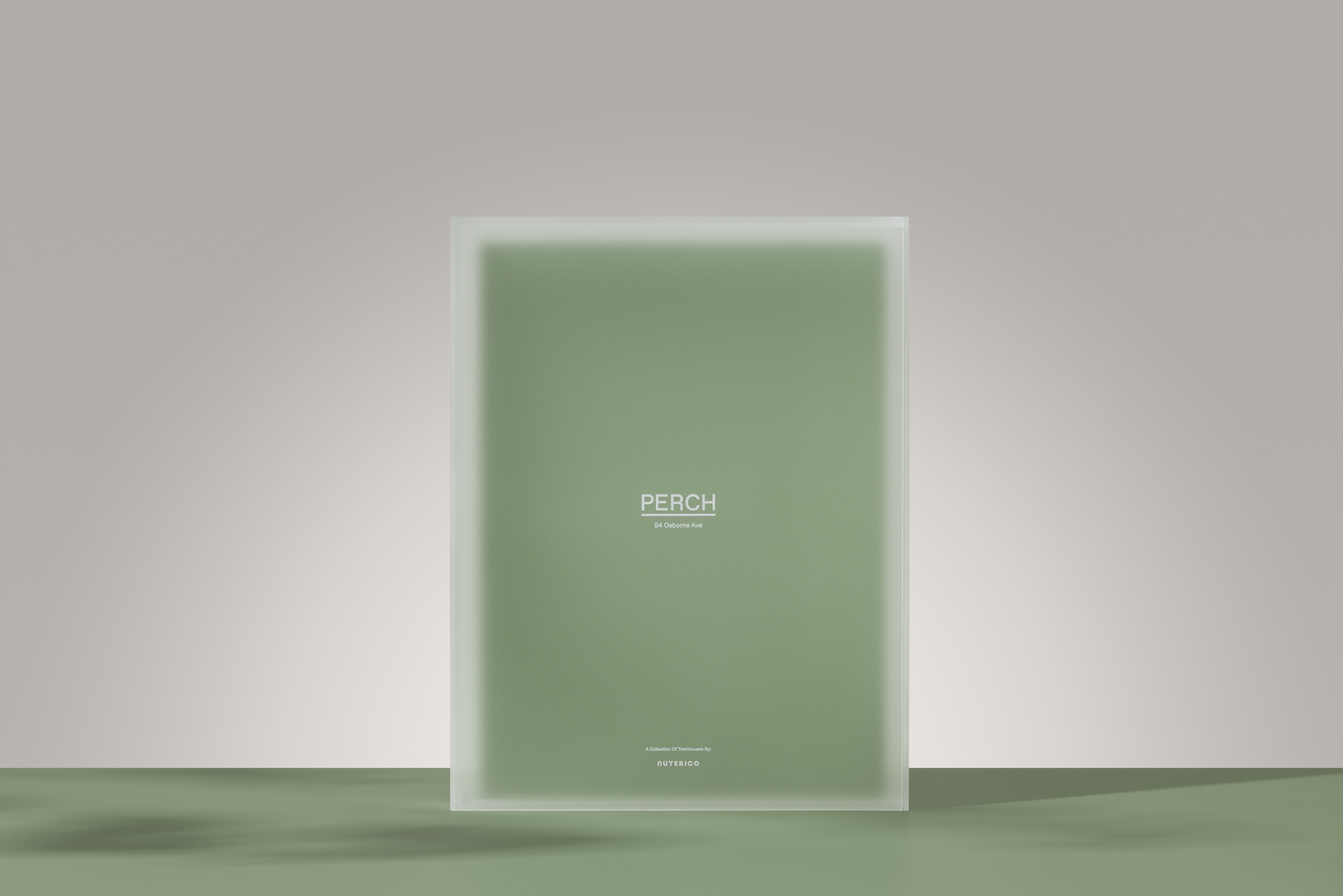
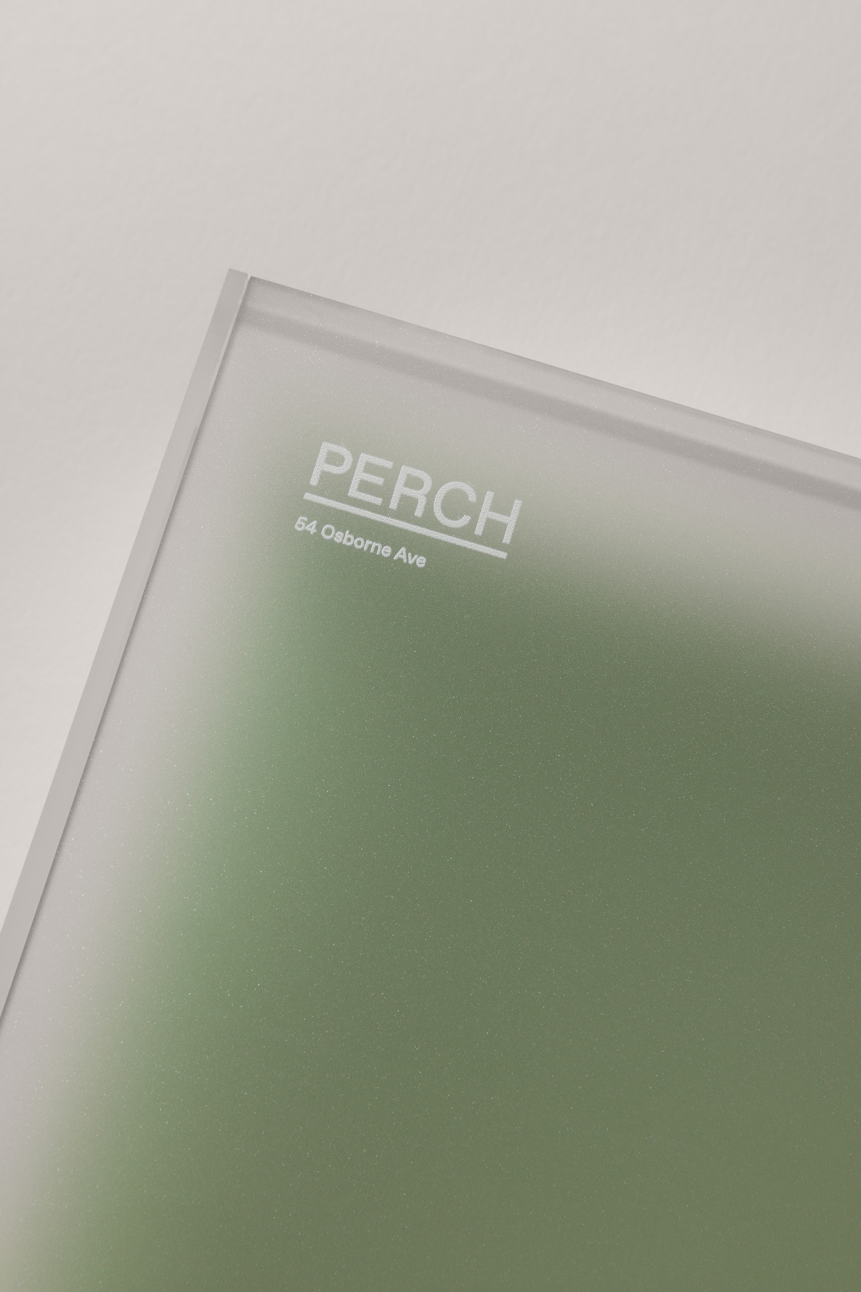
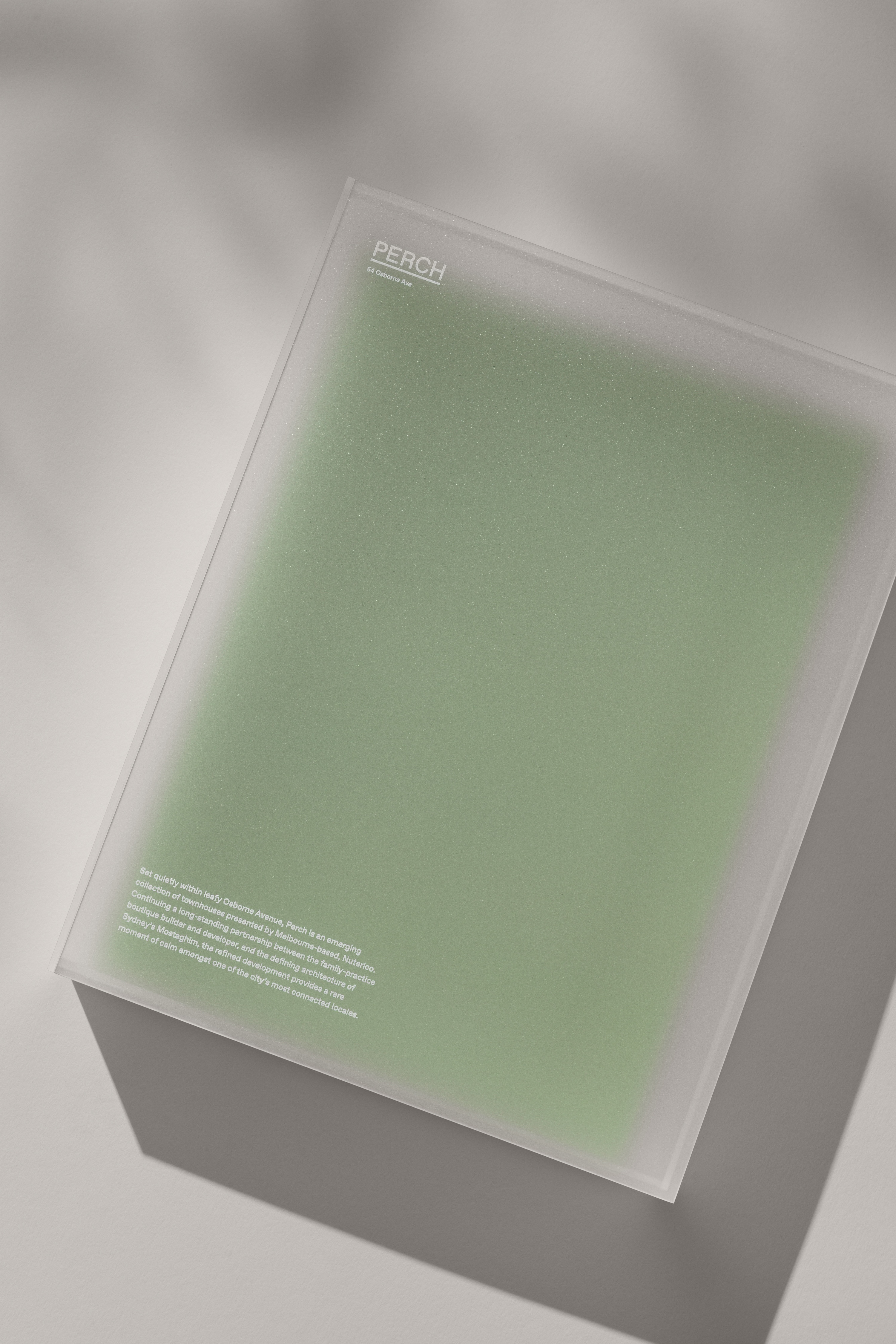
The hero brochure is housed within a custom Perspex box, deliberately concealing its contents until it is removed and opened. Inside, translucent stocks introduce further layers, allowing imagery and information to emerge gradually through the publication.
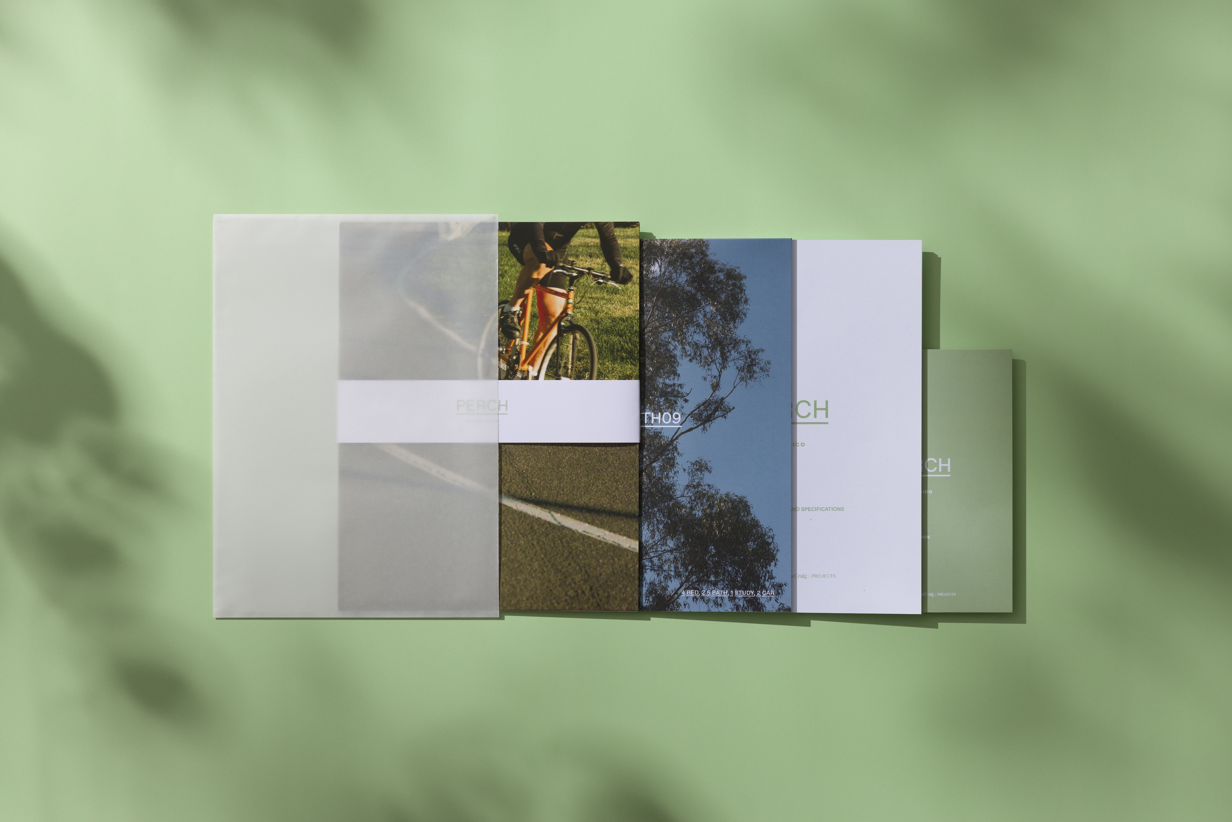
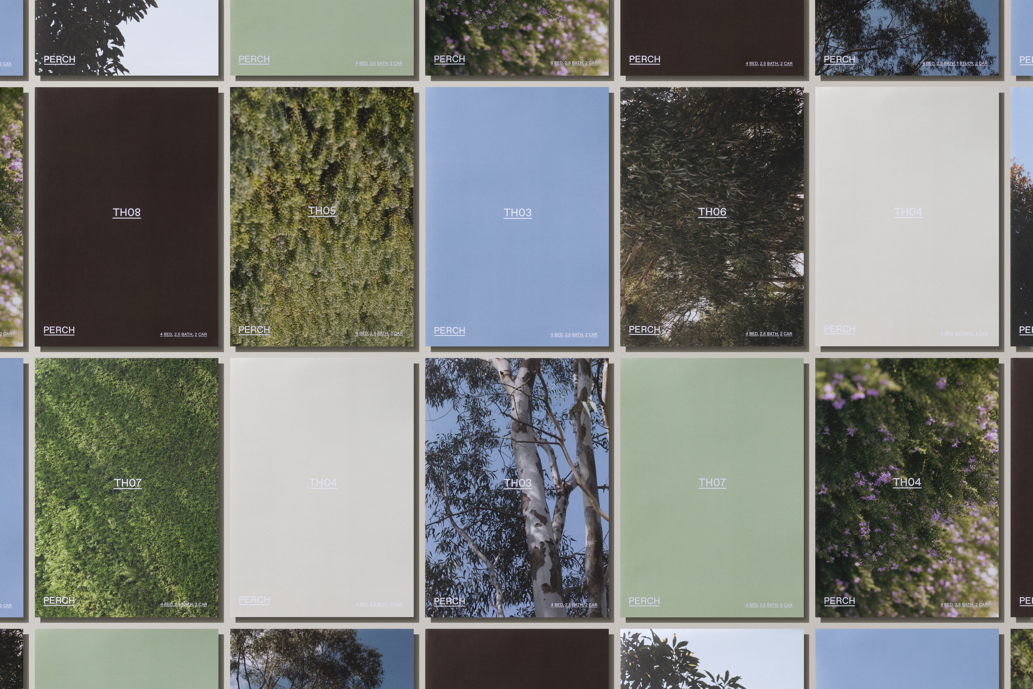
This tactile approach extends across the wider collection, including the finishes guide, fact book, location guide and floorplans. Paper, print, packaging and composition work together to create a visual identity that feels restrained and tactile, while remaining closely connected to the landscape surrounding Perch.
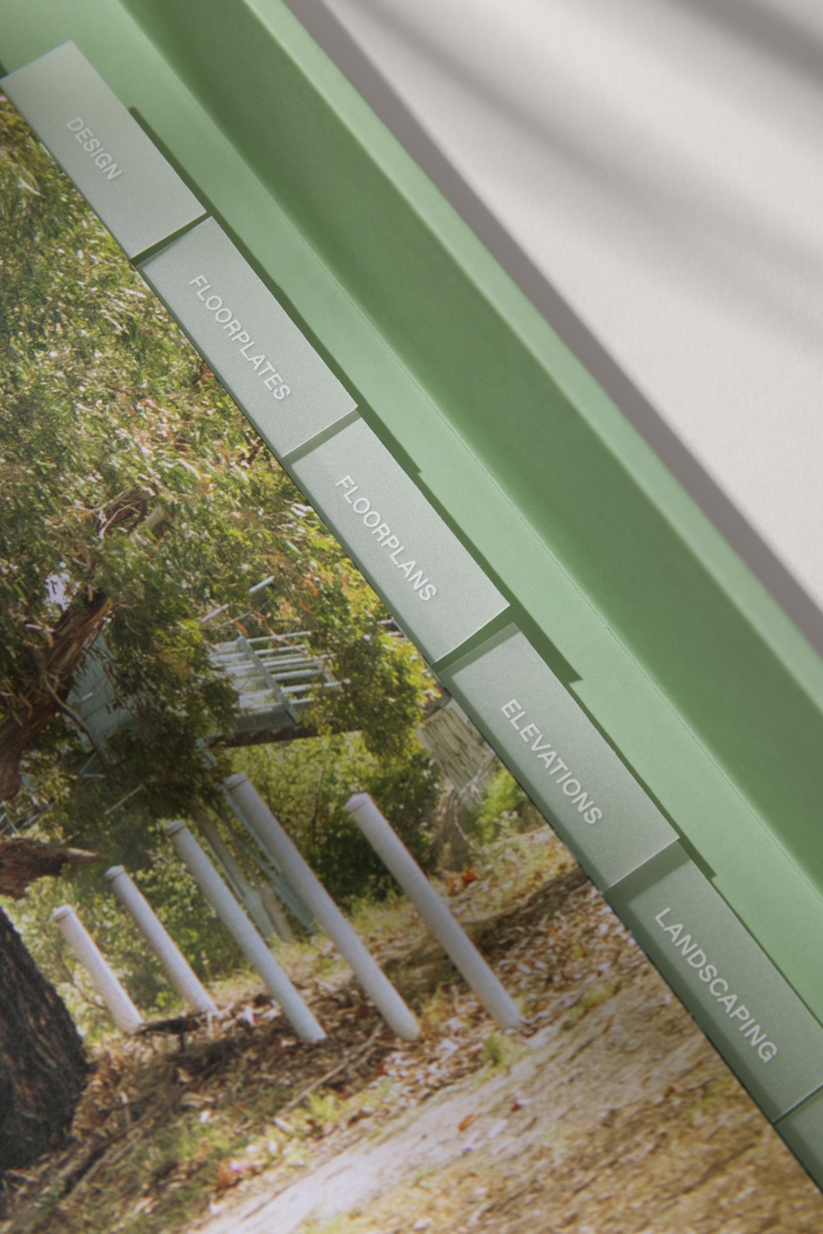
The brochure was conceived as an editorial object, with the relationship between image, information and material forming the basis of its composition.
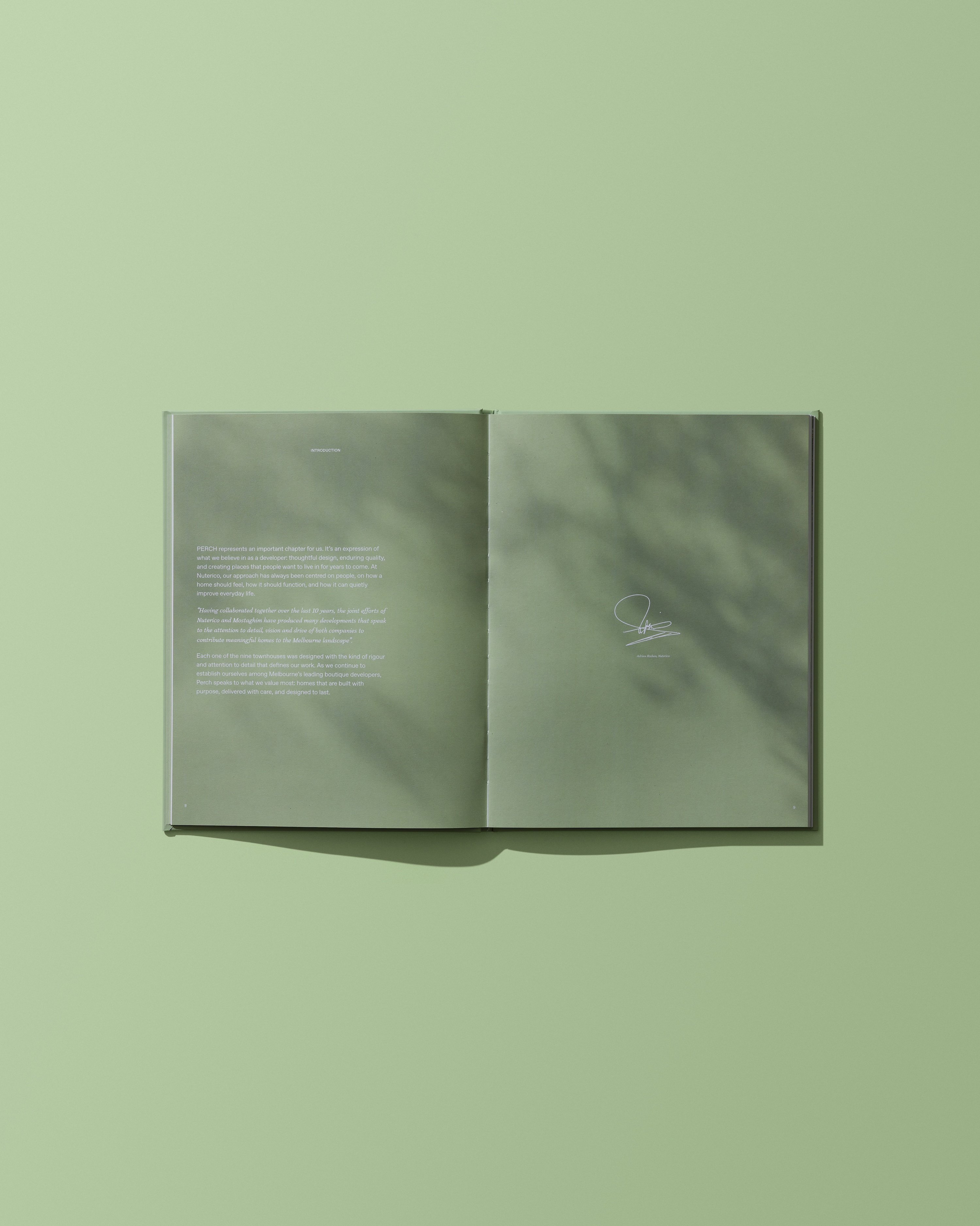
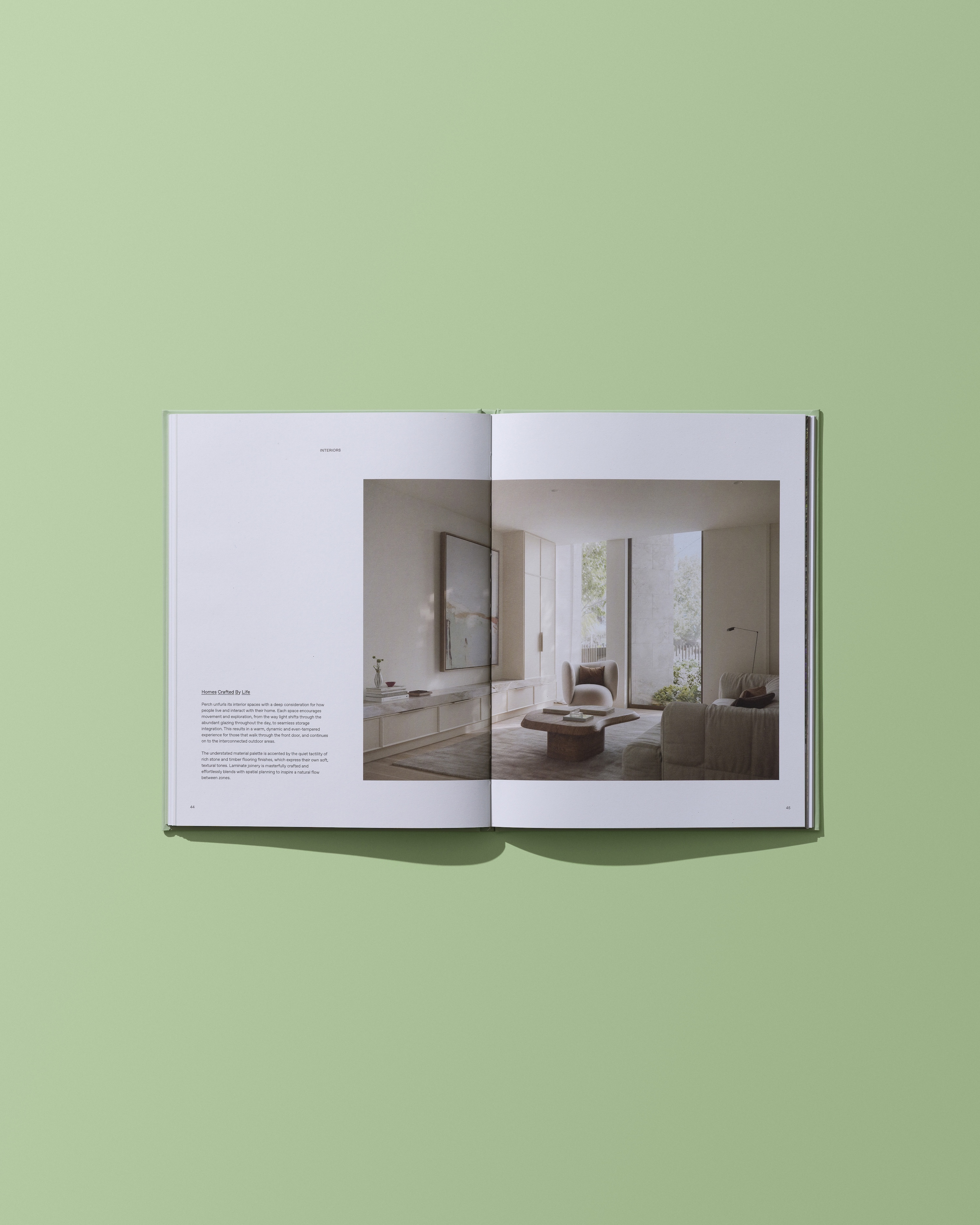
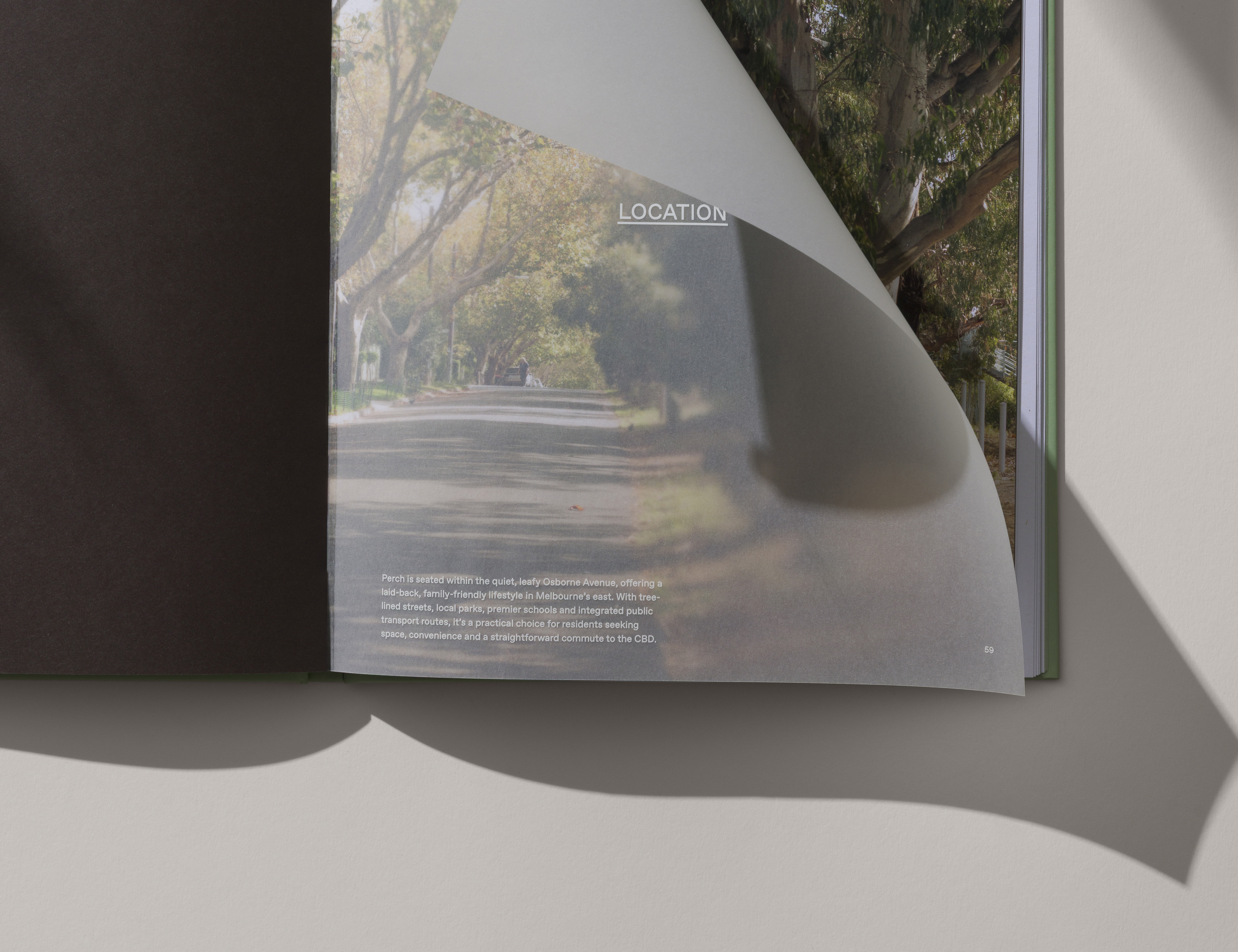
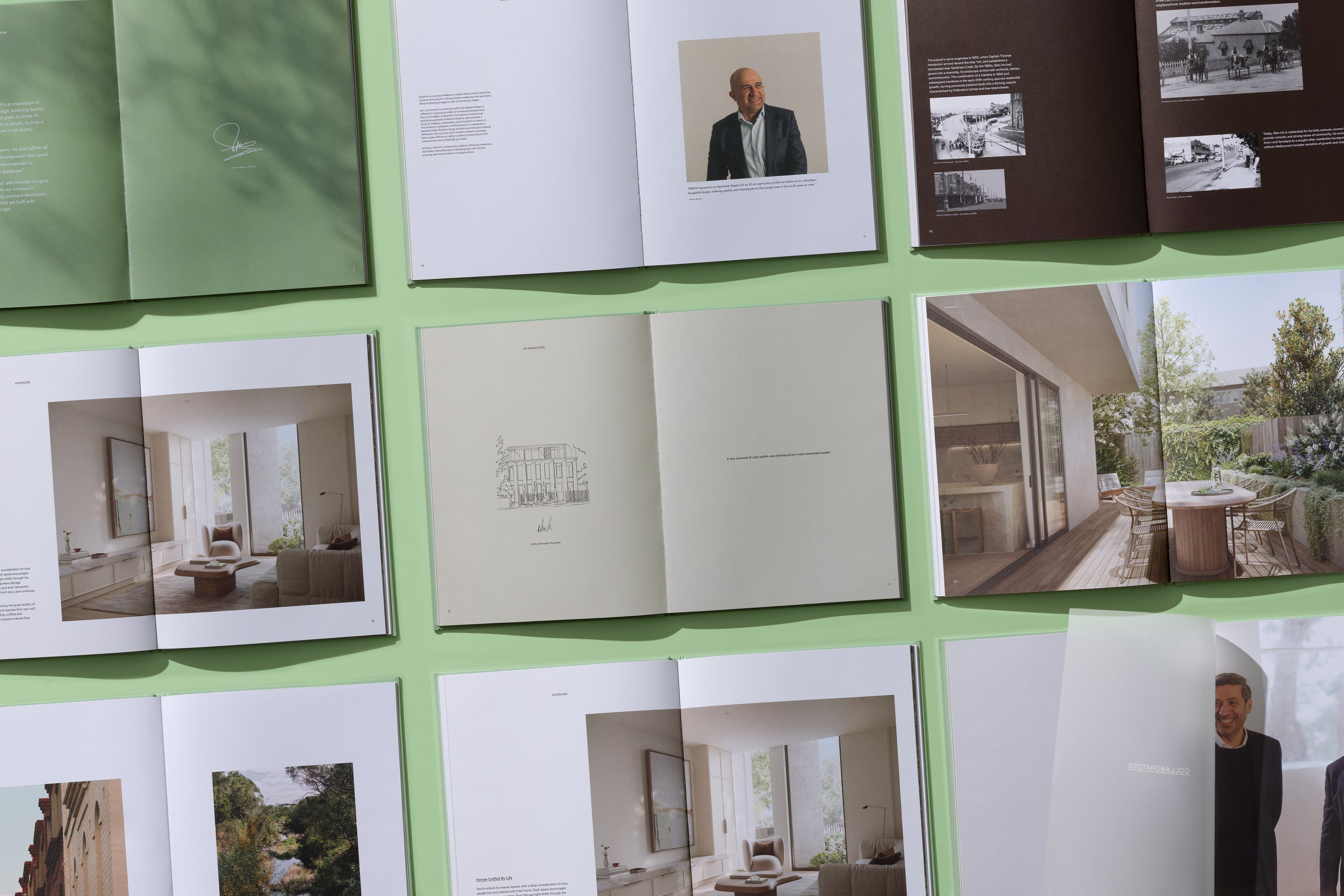
Across the spreads, we explored with scale, negative space and pacing to establish a quiet rhythm between architectural imagery, editorial copy and project information. Translucent pages punctuate the sequence, creating moments of opacity and reveal as the reader moves through the publication.
The palette draws from the immediate surroundings: deep greens, warm browns, soft greys and muted blues, bringing the landscape, interiors and architecture into a shared visual register.
Rather than relying on a dominant graphic device, the identity emerges through accumulation: the weight of the paper, the treatment of imagery, the space between elements and the progression from one spread to the next.
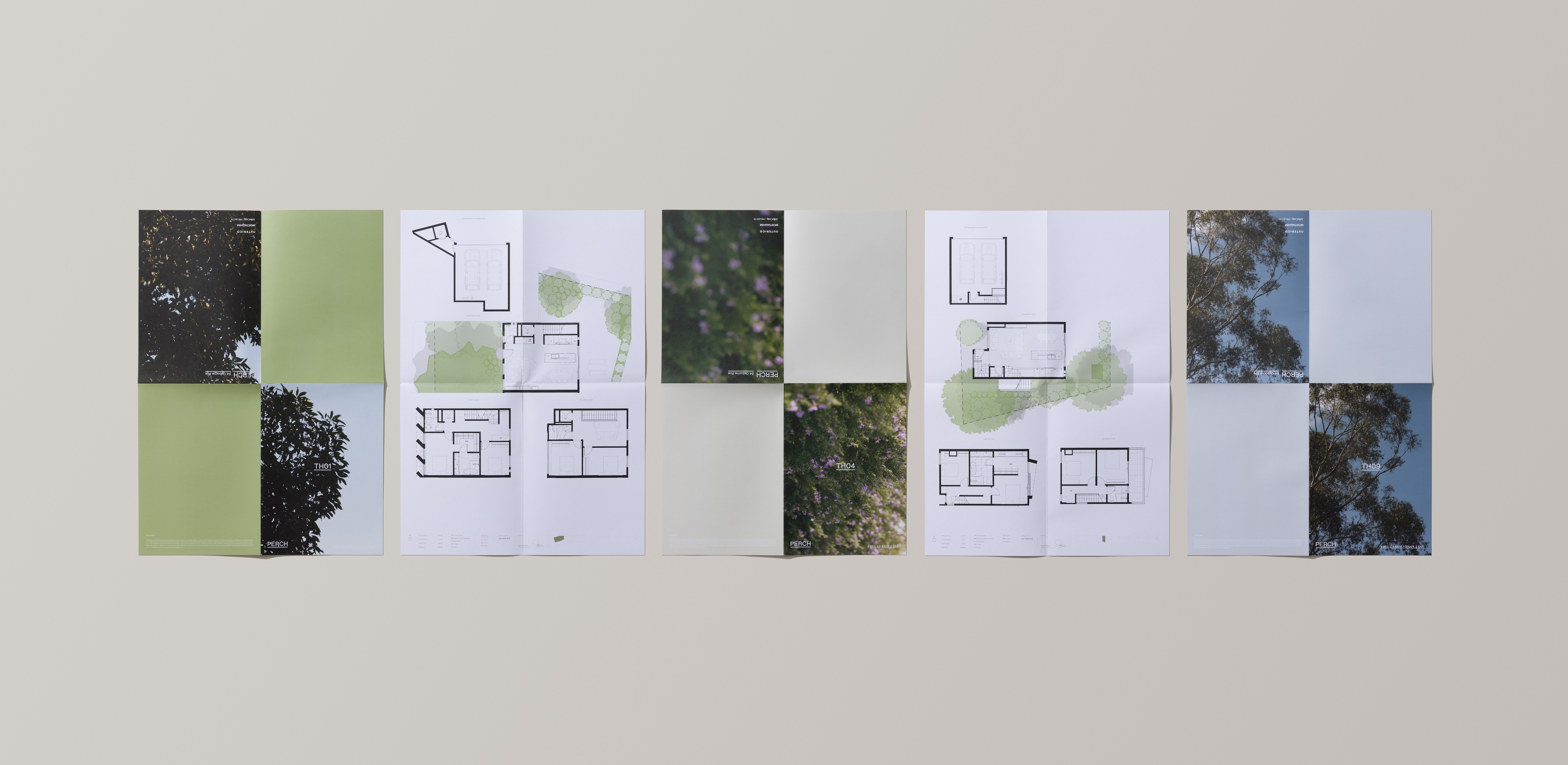
The floorplans were treated as an extension of the publication rather than a functional chapter set apart from it.
Architectural drawings are given generous space and a restrained typographic hierarchy, allowing the plans to remain precise while sitting naturally within the broader visual language.
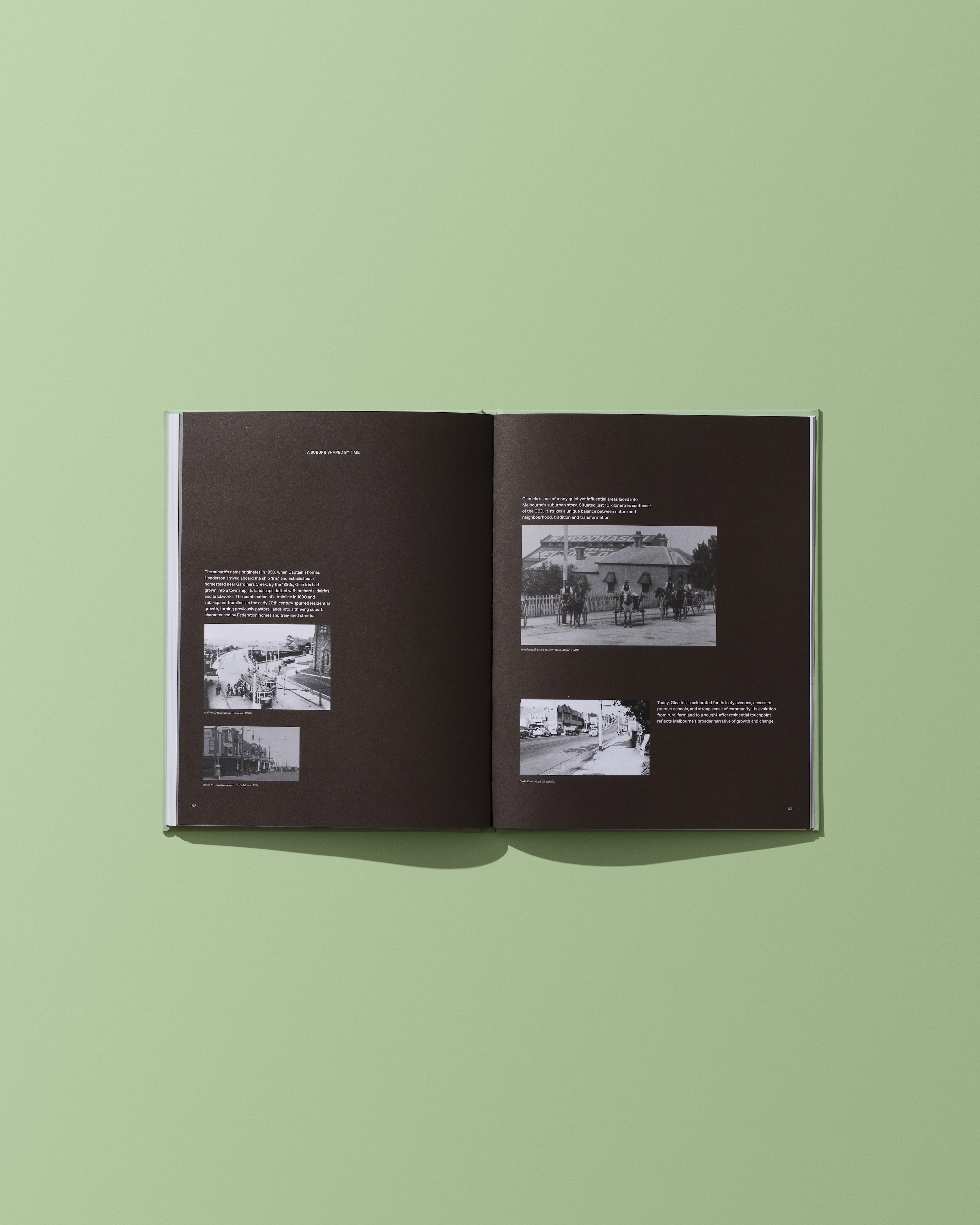
Photography of Glen Iris sits alongside the drawings, introducing the surrounding landscape into the pages and placing each residence within its wider context. The palette continues through the layouts, drawing from the gardens, architecture and interiors.
Information is deliberately edited and hierarchy remains subtle, allowing the drawings to hold focus.
A practical component, resolved with the same attention to composition and detail as the wider Perch identity.
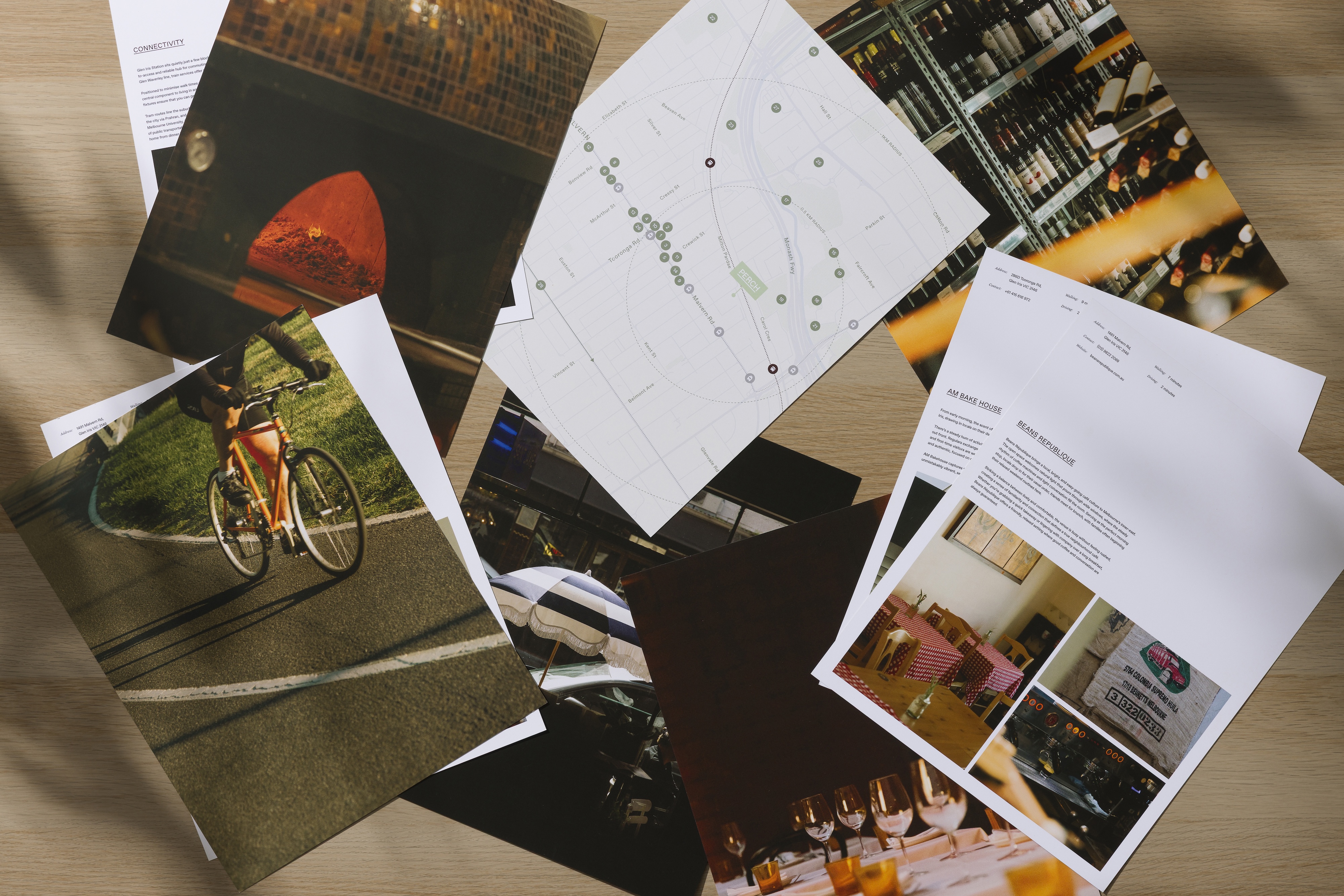
The location guide shifts the focus from Perch to the neighbourhood that surrounds it.
We approached the guide as a collection of loose photographic sheets, pairing images of Glen Iris with information on the places, amenities and everyday destinations that shape life in the suburb.
The unbound format allows the guide to be explored gradually, with individual sheets moving between image and information. A detailed map provides the practical framework, complemented by walking and driving distances and a considered selection of local references.
Photography focuses on the quieter details of Glen Iris:established greenery, streetscapes and familiar local moments, creating a portrait of the suburb that feels closer to an editorial archive than a traditional property guide.
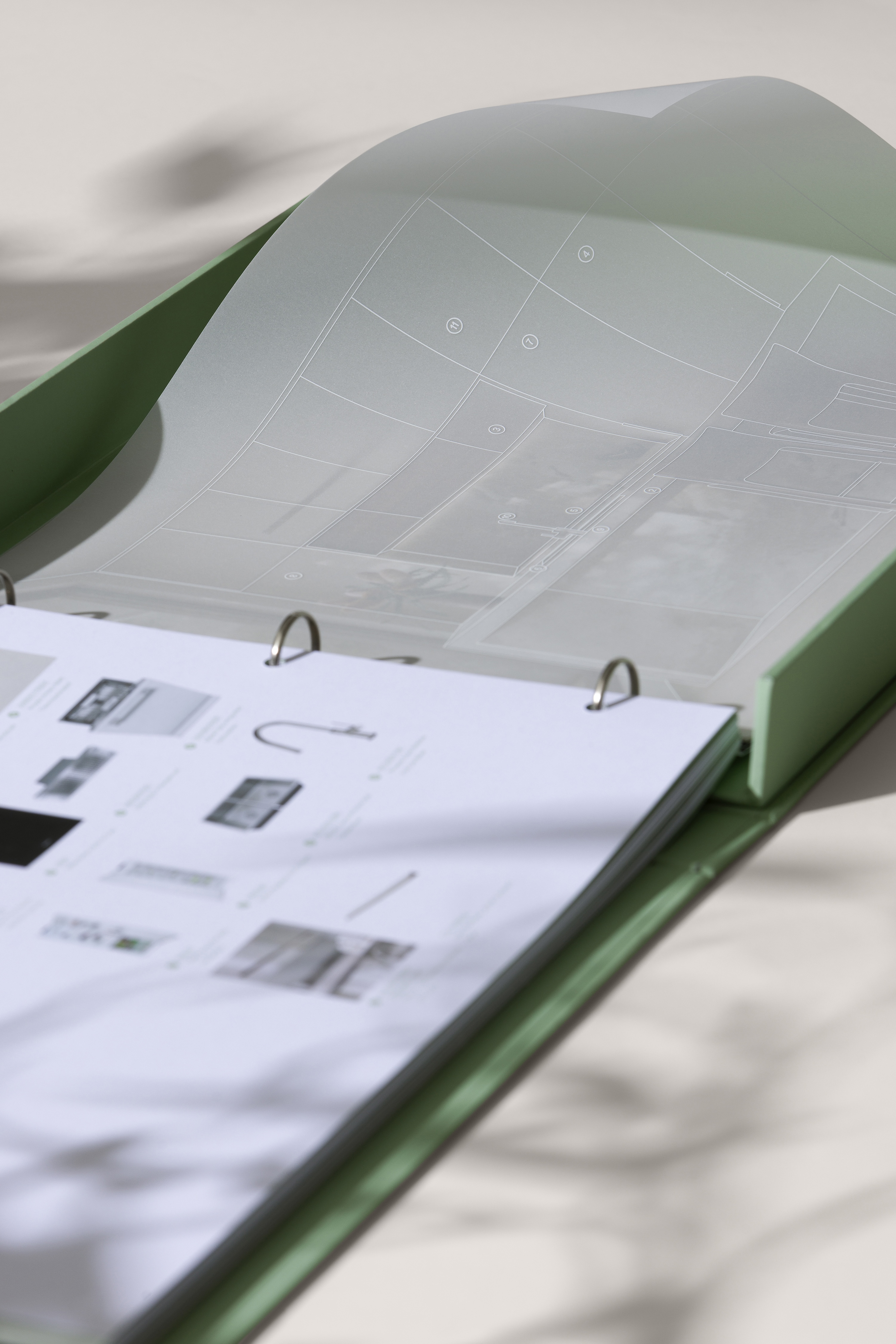
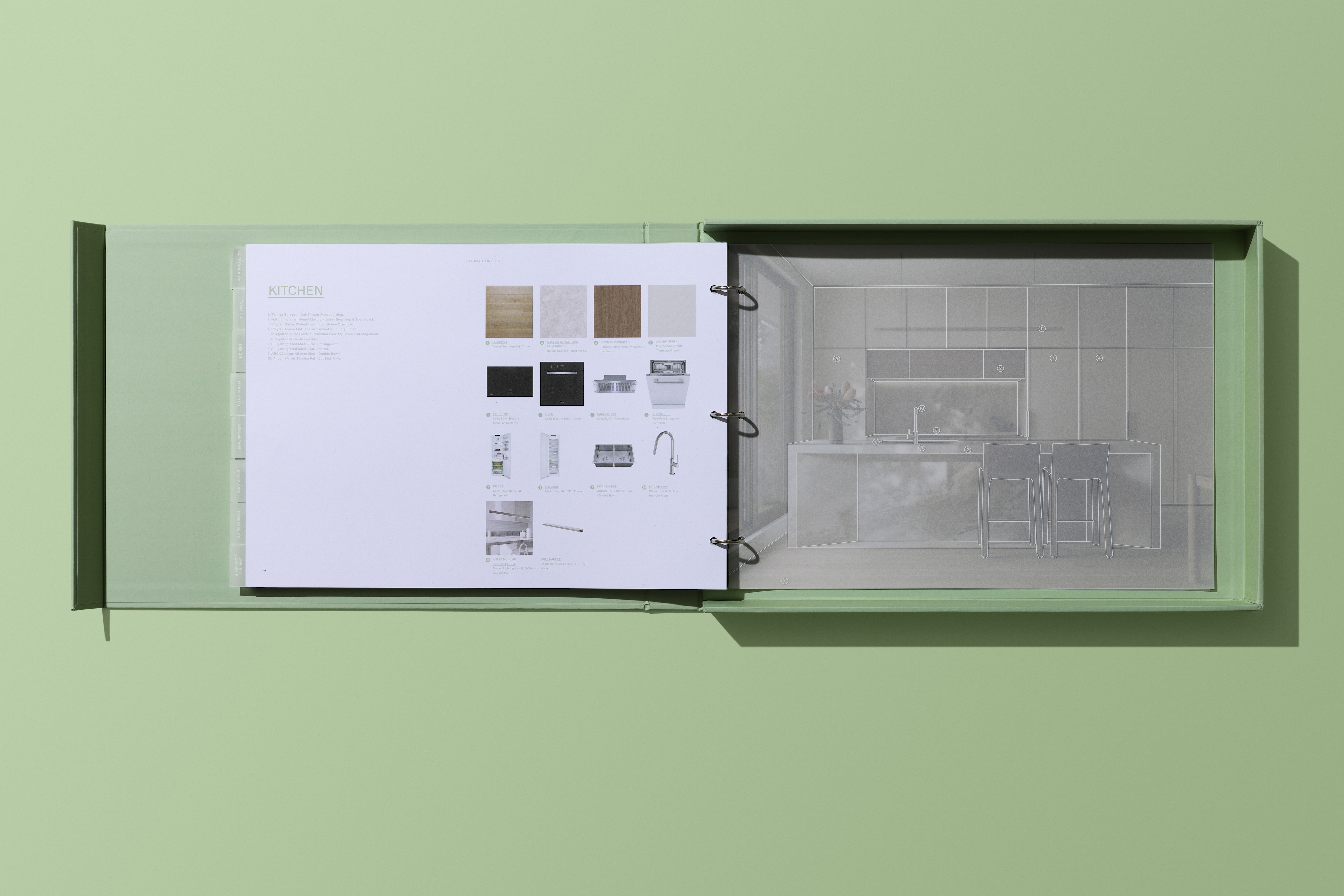
The agent’s brochure extends the identity’s exploration of transparency, layering and materiality into a more focused format.
Translucent stock overlays an outline drawing of the interior, allowing fixtures and finishes to sit lightly across the page before the completed space is revealed beneath. As the layers shift, drawing, material and image come into alignment.
The interaction is deliberately simple, giving the reader an active role in uncovering the detail of each interior.
Typography, colour and paper stock remain consistent with the broader collection, creating continuity while allowing the architecture and interiors to remain the focus.
Information becomes something to discover rather than simply consume.
The visual language developed for Perch extends beyond the printed page, translating its sense of translucency and reveal into the digital environment.
We emulated the material qualities of the identity across socials, EDMs and the project website, where blur, movement and transparency become digital interpretations of the physical experience.
Images emerge progressively, echoing the act of moving through the brochure and discovering what sits beneath each layer.
Architectural renders bring the residences into focus, capturing warm interiors, natural materiality and generous openings that connect the homes to Glen Iris’ established landscape.
Across print and screen, the same visual sensibility remains: a restrained, immersive approach where imagery and information are allowed to unfold.
Perch is an identity built around discovery. From the Perspex box and translucent paper stocks to the layered spreads, loose-leaf location guide and digital reveals, we carried a single conceptual idea across every touchpoint without allowing it to become repetitive.
The result is a brand experience that feels tactile without being excessive, editorial without losing clarity, and closely connected to the leafy character of Glen Iris.
A visual identity that reveals itself gradually, much like the development itself.
Scope:
Collaborators:
Nuterico (Developer)
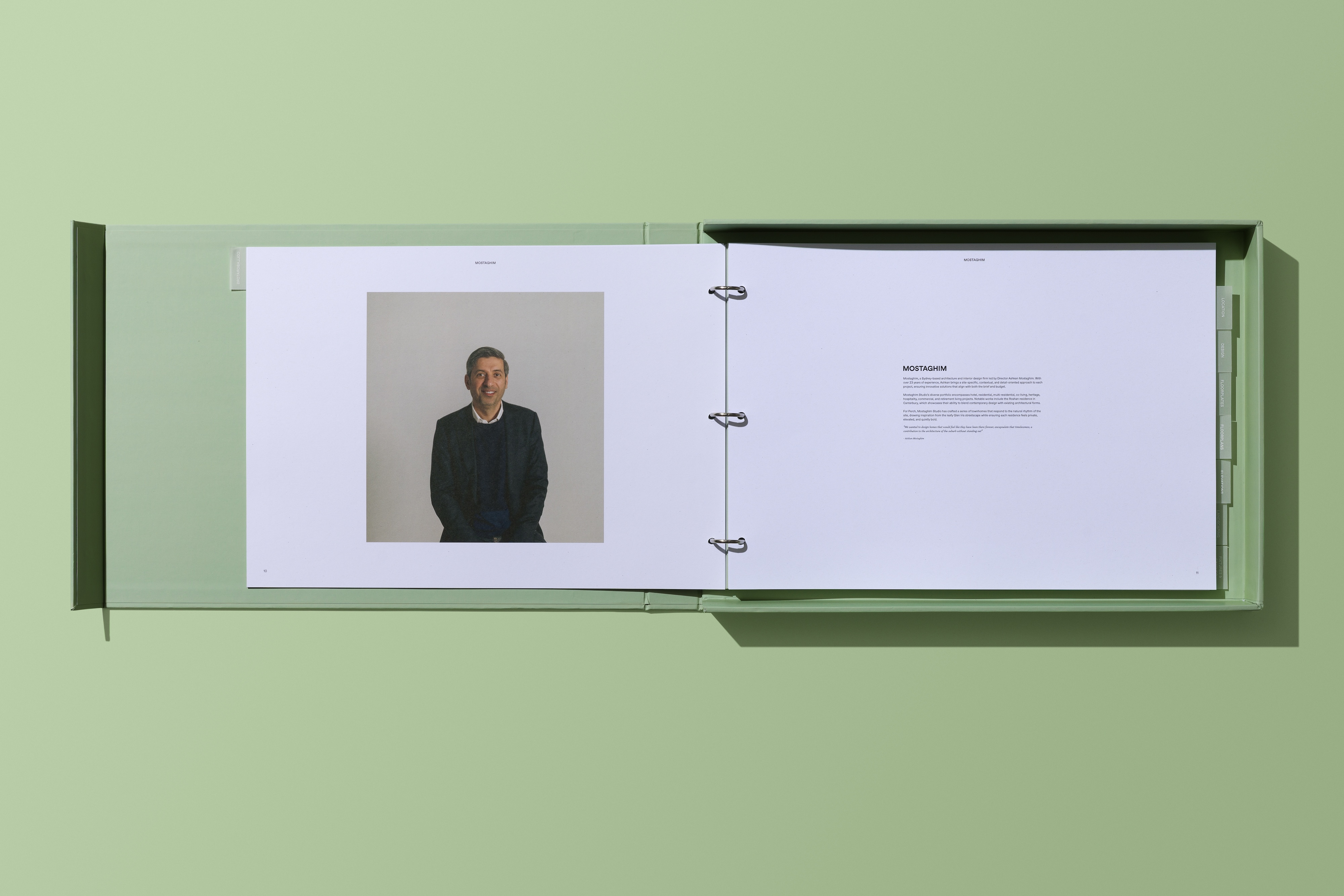
Mostaghim (Architect)
John Patrick (Landscapes)
Studio Piper (Renderer)
WorkWorks (Printer)
- Lifestyle Photography