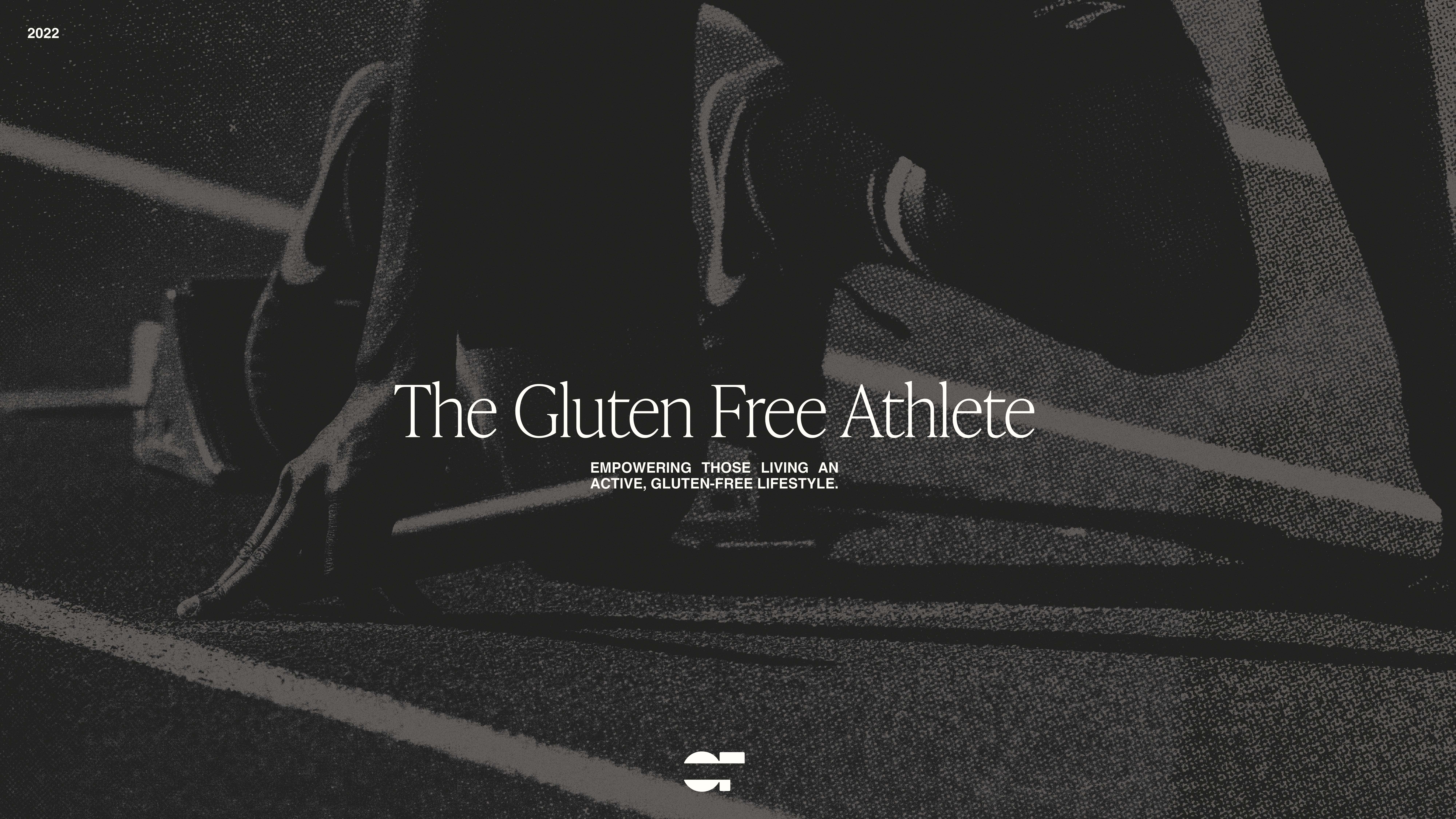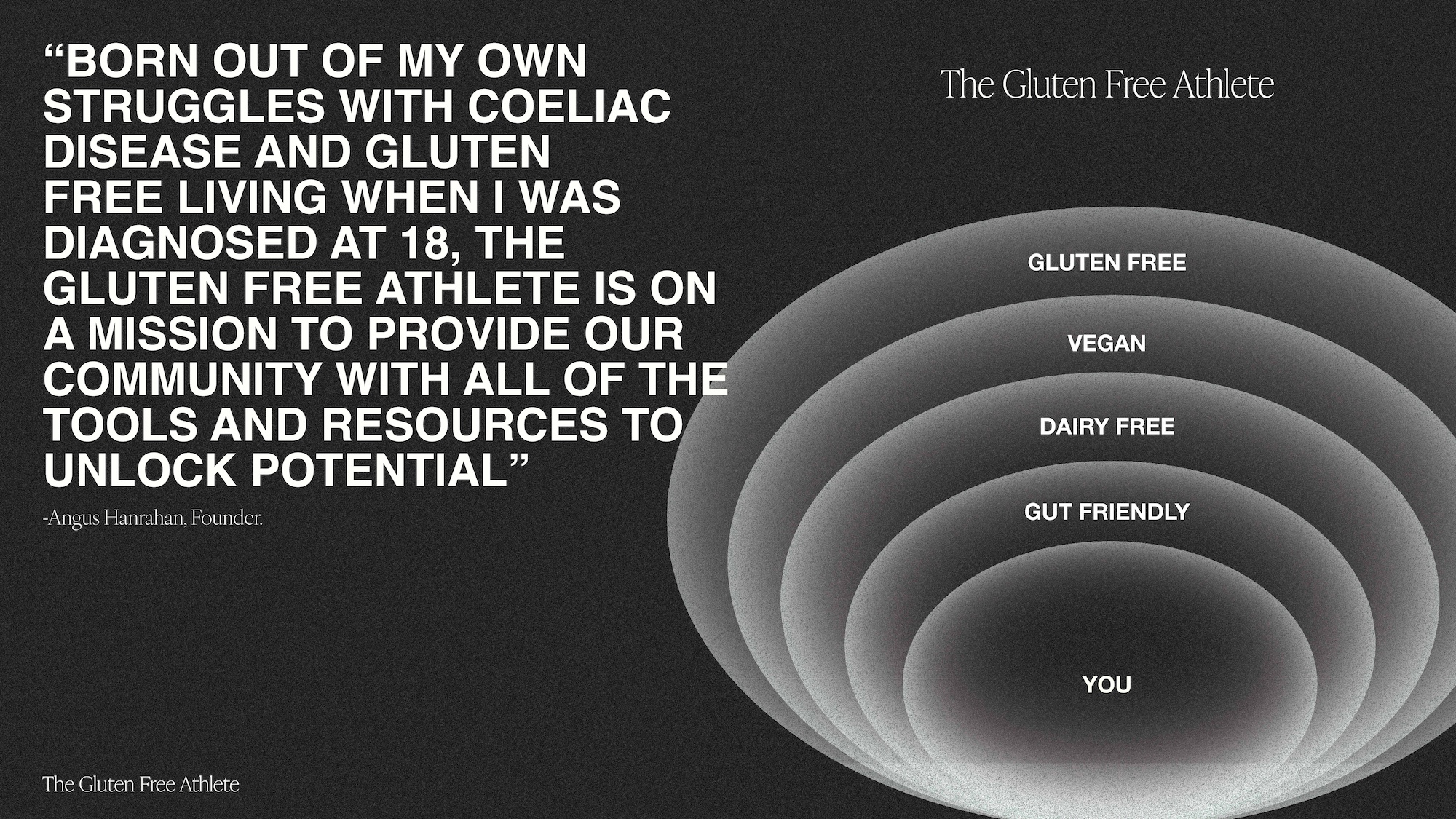
The Gluten Free Athlete has emerged as a modern benchmark in gluten-free sports nutrition, delivering high-performance, coeliac-safe sustenance for athletes who refuse to compromise. As the brand expanded its reach and refined its purpose, Studio Nascent was engaged to reimagine its identity, elevating its presence to reflect both scientific credibility and modern lifestyle appeal.
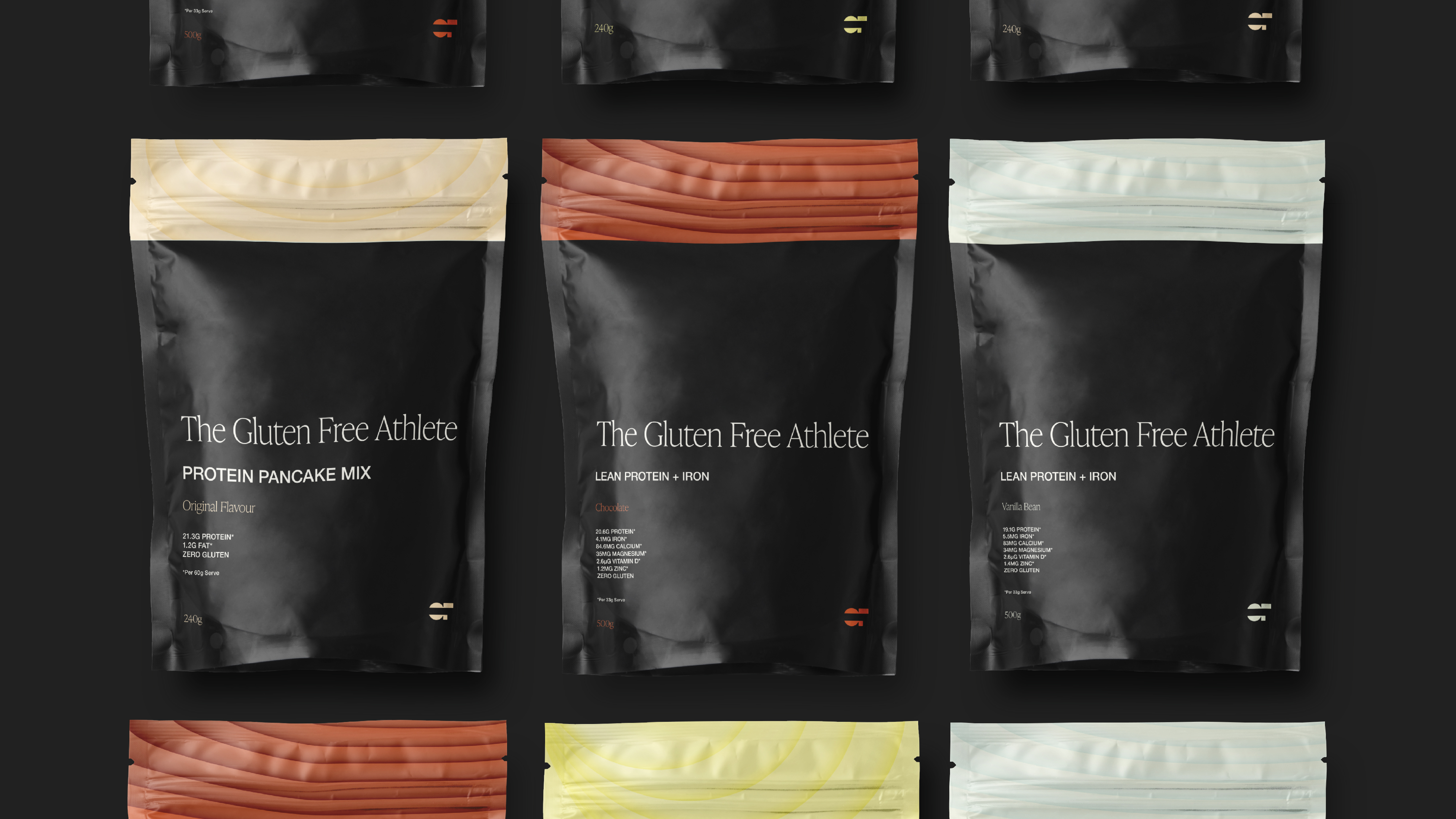
The new identity is anchored in a clean, minimal visual language designed to let the brand lead. A sharp, abstract brand icon, formed from the letters “GF” with a distinct strike-through serves as a bold marker of gluten-free assurance. This symbol becomes both a functional identifier and a visual motif across product and digital environments.
To bring clarity and energy to the packaging system, we introduced a gradient motif that plays out across the product range. Each gradient was crafted to reflect the flavour profile of the product it represents, visually differentiating SKUs while maintaining tonal cohesion throughout the brand. A fresh, modern typography system pairs bold, legible sans-serif weights with refined, thinner fonts to create balance and visual hierarchy across every touchpoint.
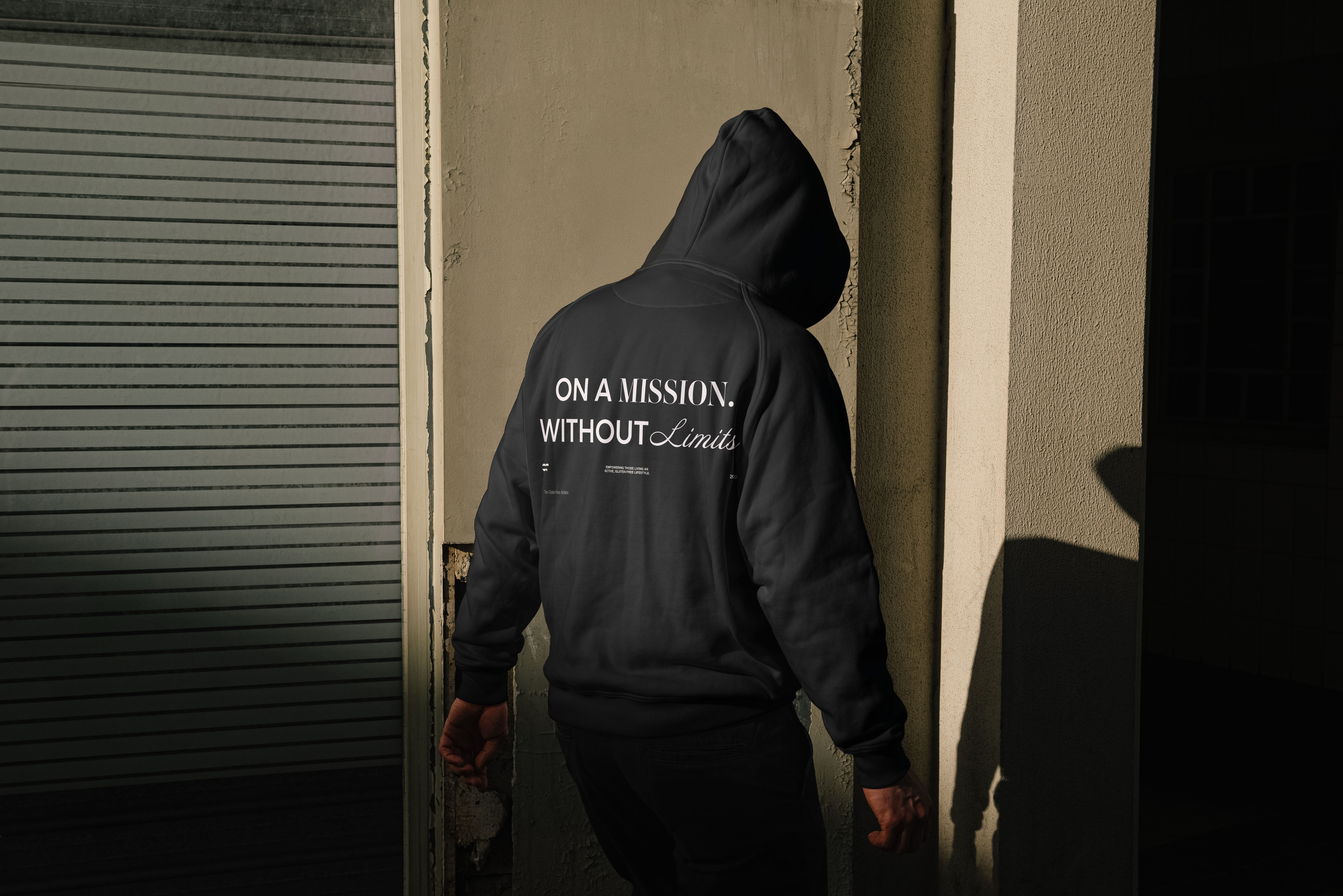
Beyond identity, we developed a cohesive photography style and social content system, focused on minamilism, movement, and modern athletic culture. Social templates and art direction ensure consistency across digital campaigns while offering flexibility to engage different audience segments with confidence and clarity.
Scope of Work