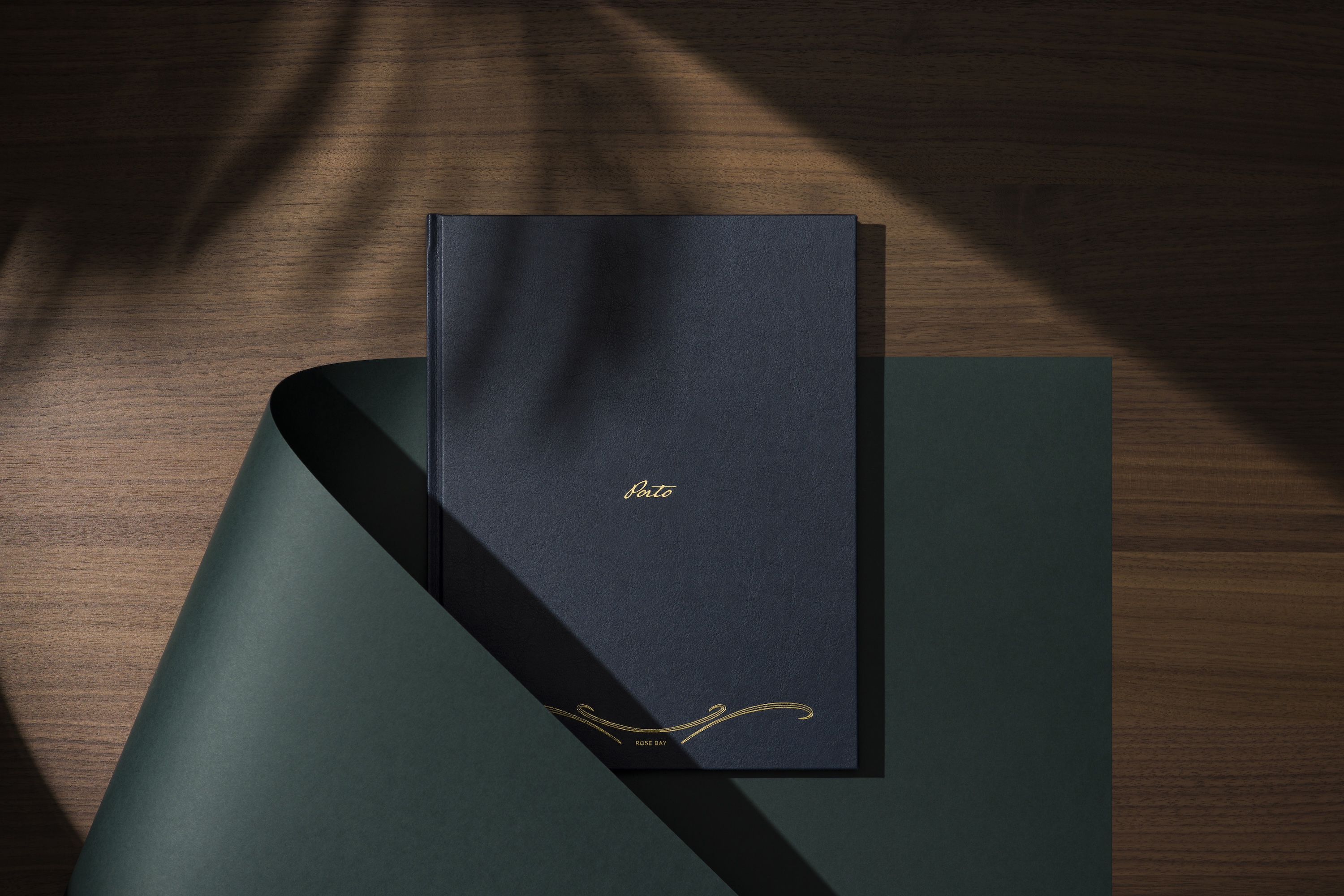
Porto is a collection of boutique residences at Rose Bay, Sydney, set within the shell of a historic Spanish Mission building dating back a century. With its period detailing, generous proportions and relationship to the harbour, the building provided a distinctive point of departure for the contemporary development.
Studio Nascent developed the creative identity in response to this meeting of heritage, craftsmanship and contemporary coastal living. Rather than treating the history of the building as a decorative reference, we looked to its sense of making and detail to inform an identity that felt tactile, collected and human.
The result is a visual language expressed through material, typography, image-making and hand-applied detail, carried consistently across print, digital and moving image.
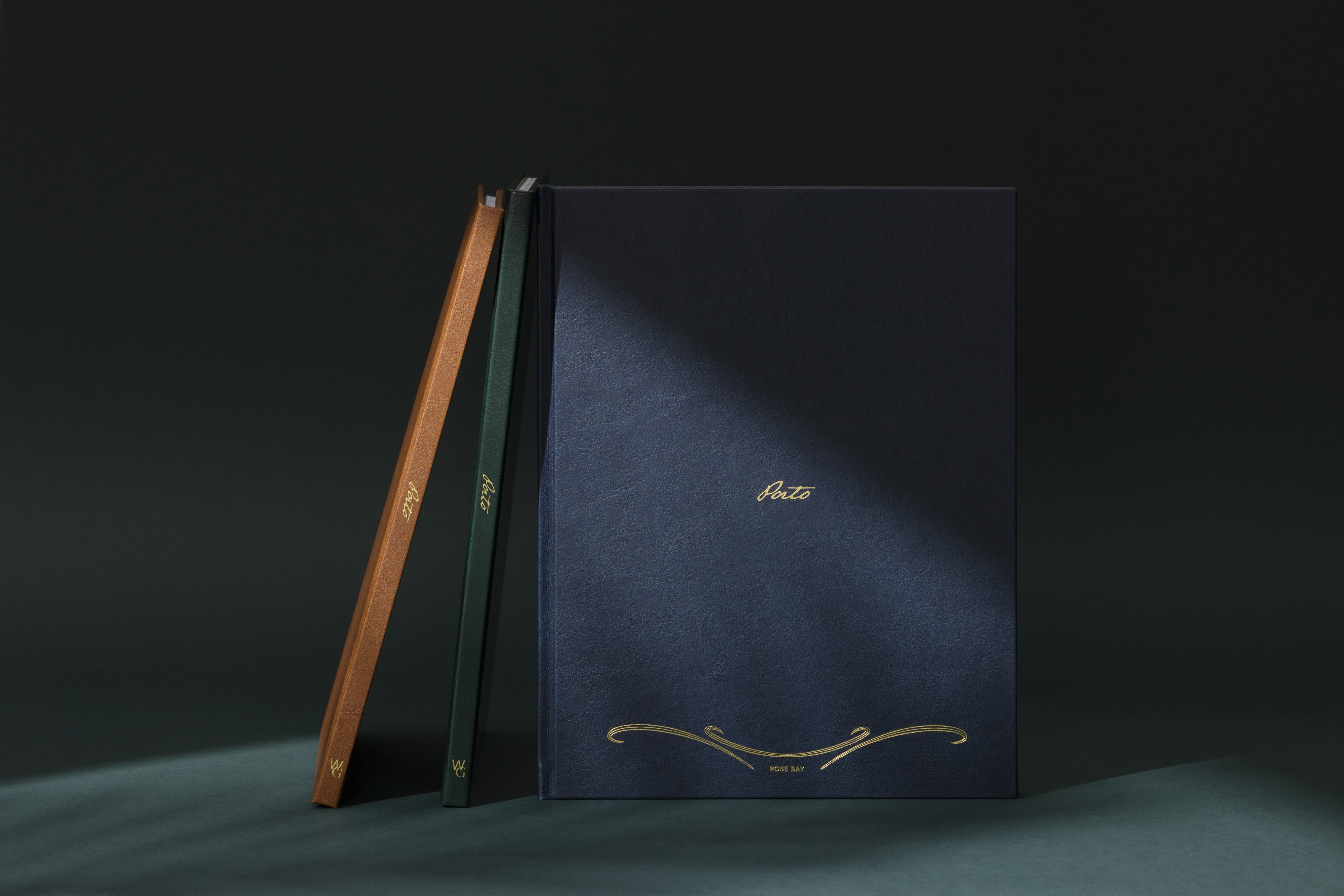
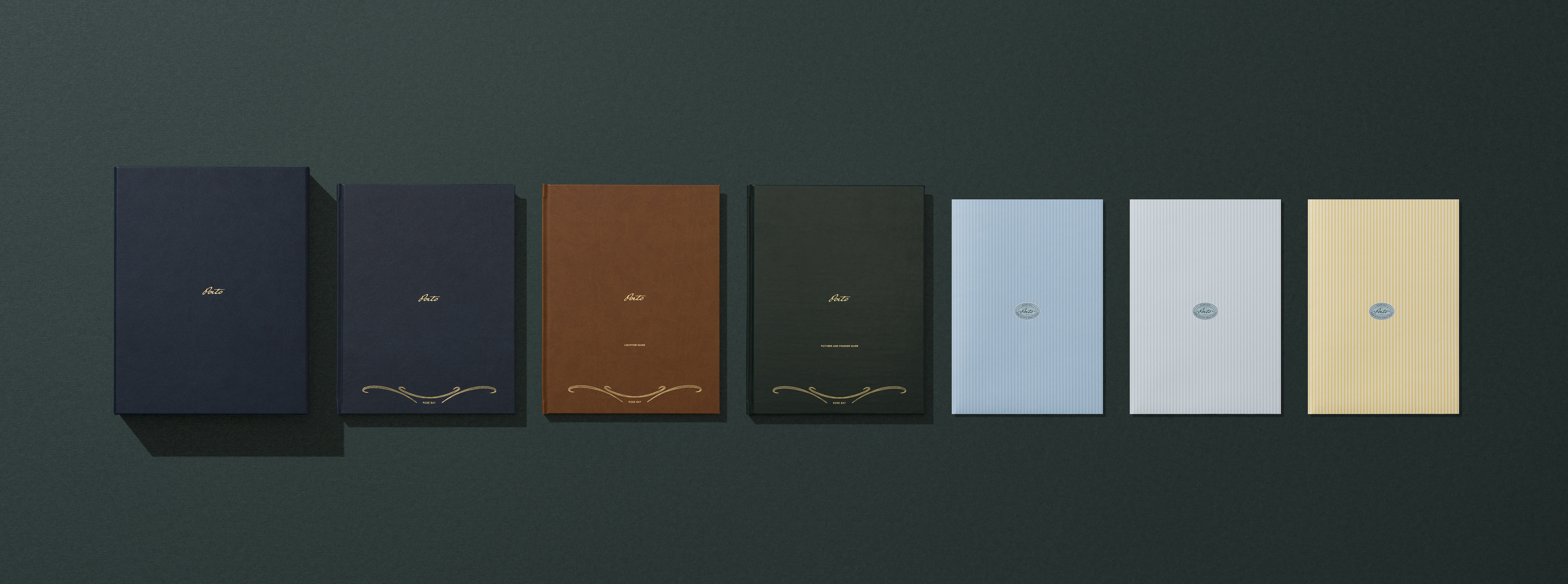
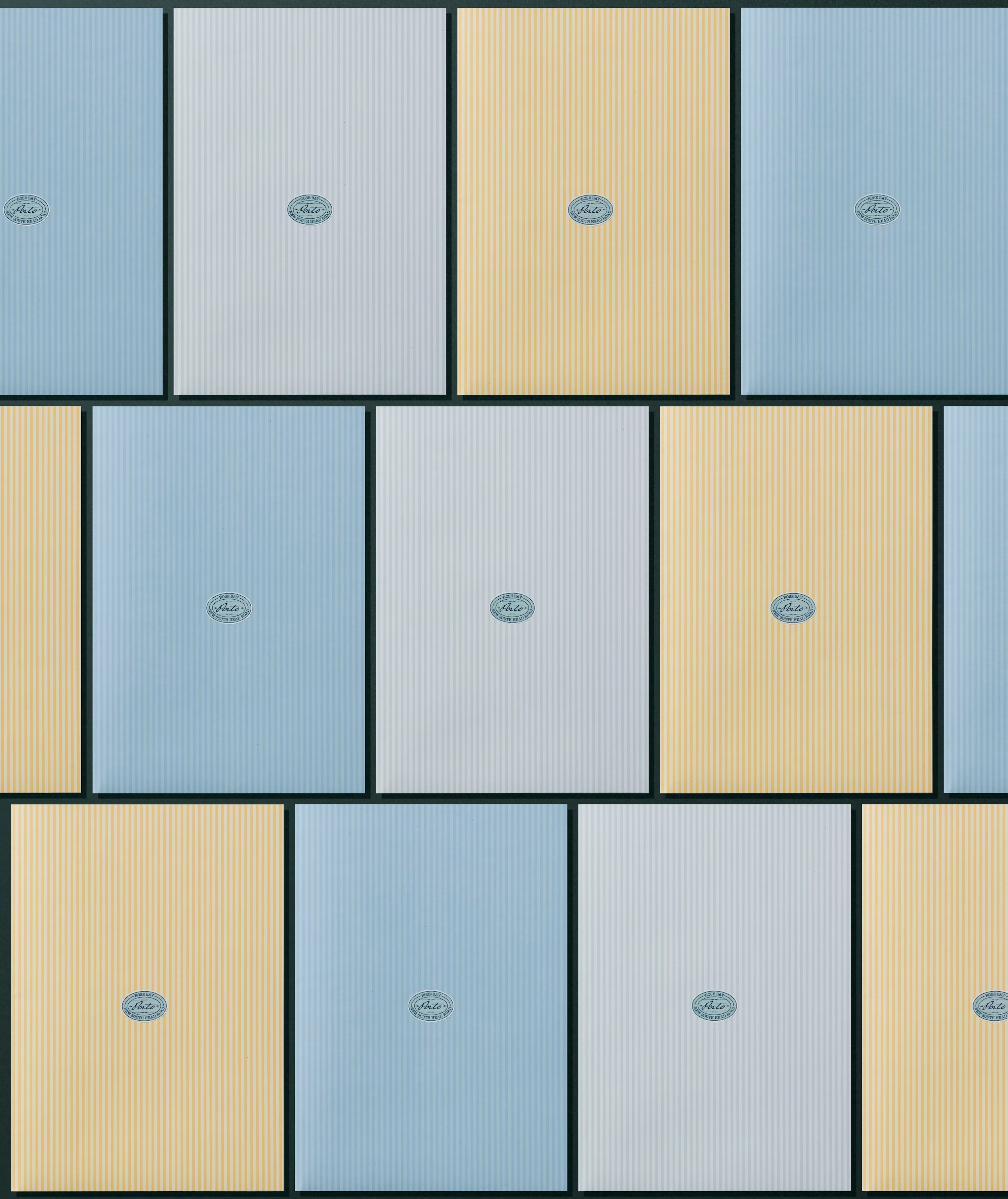
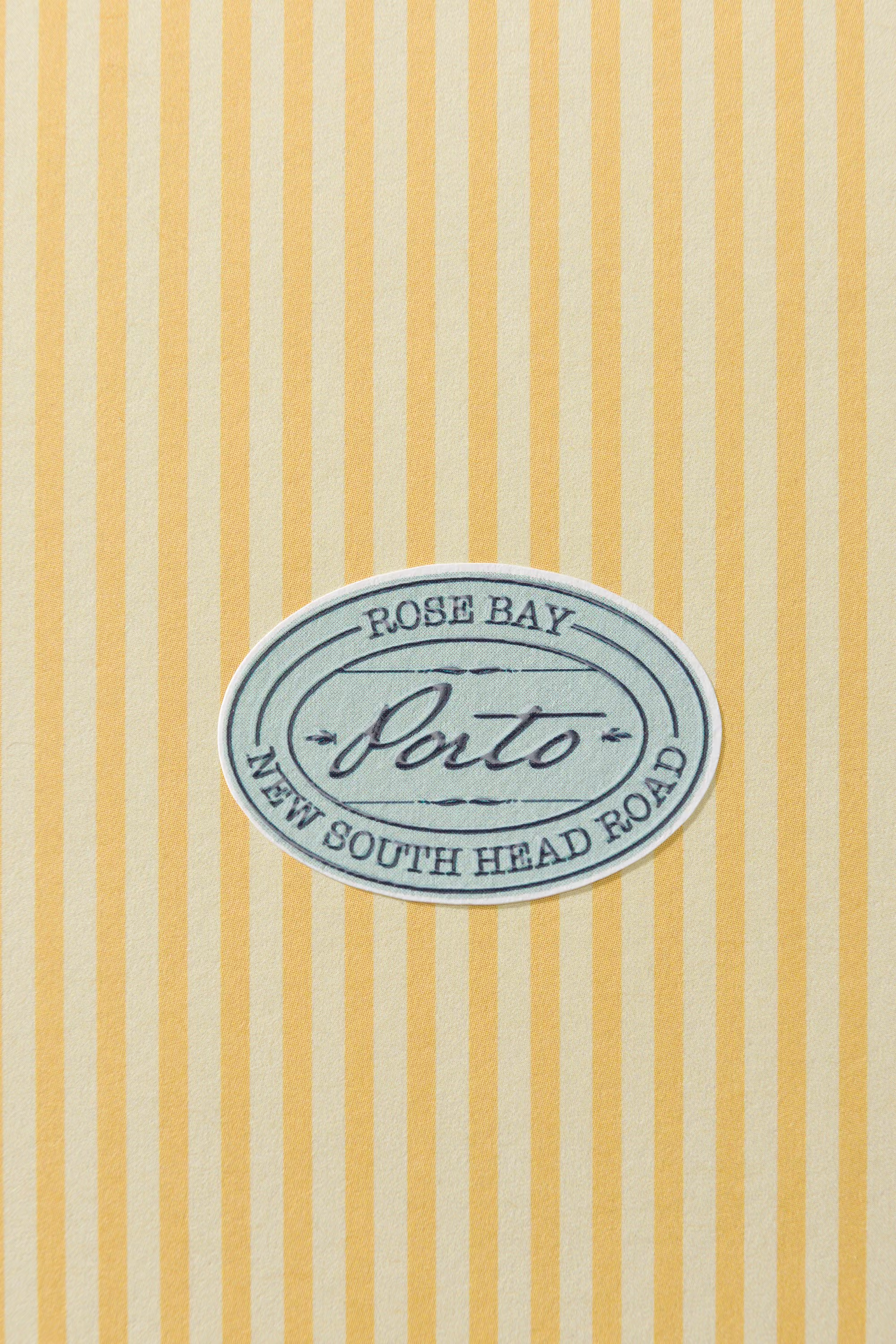
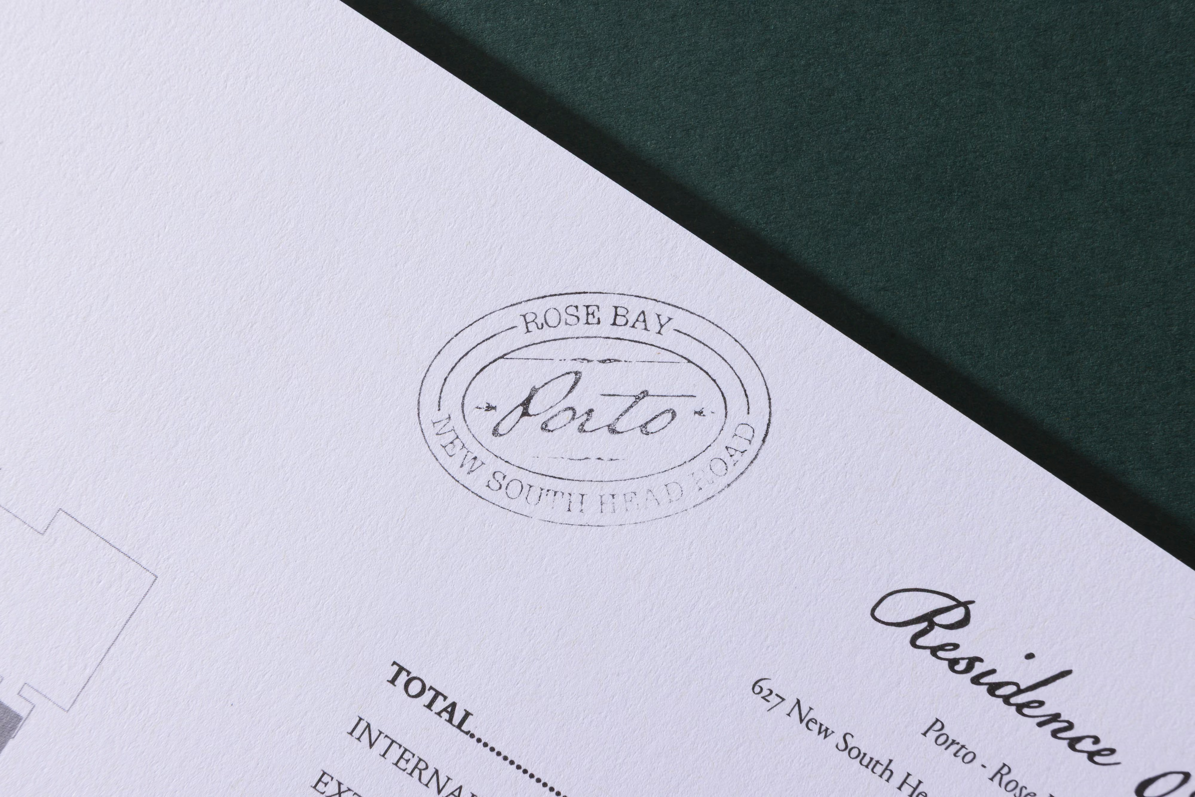
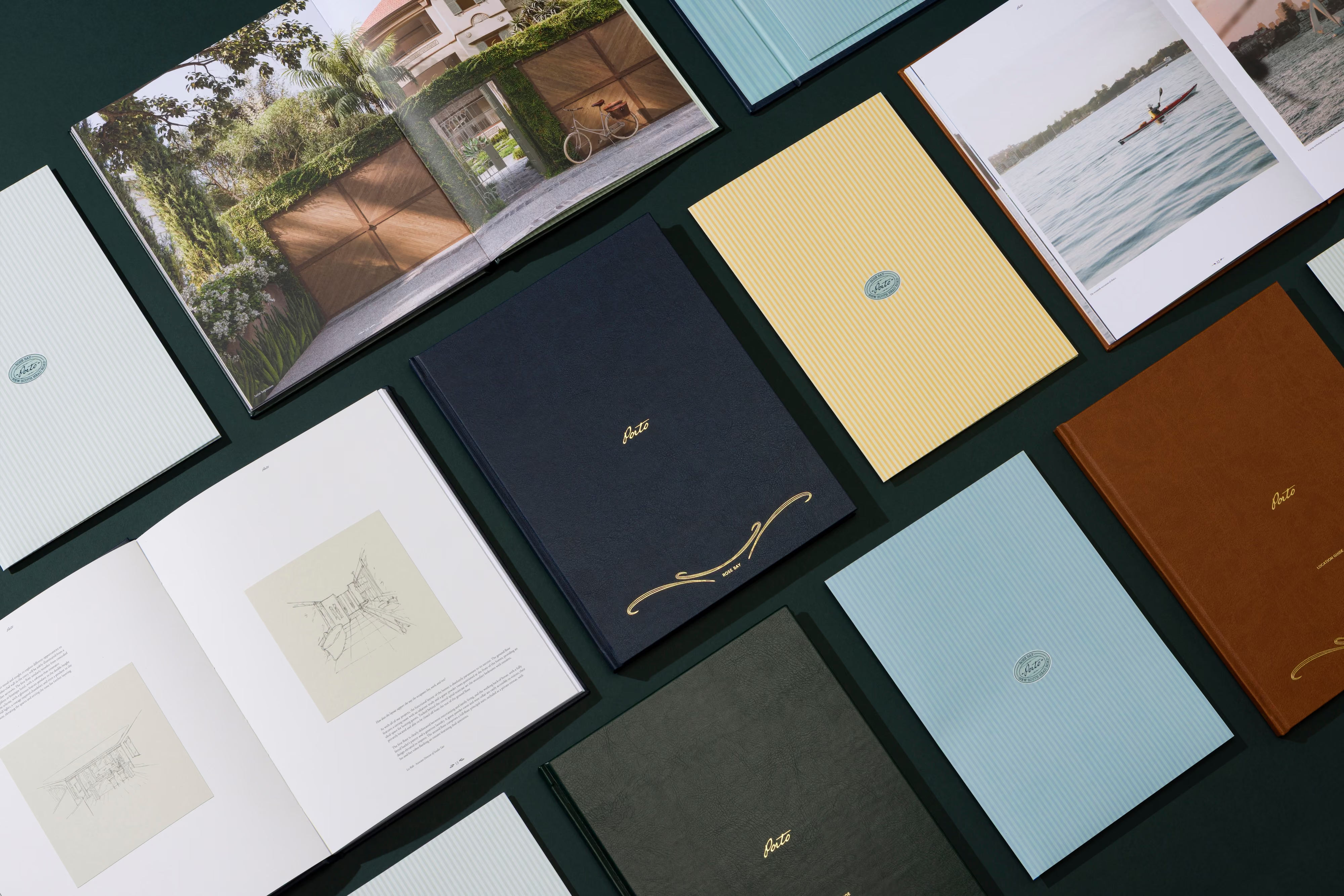
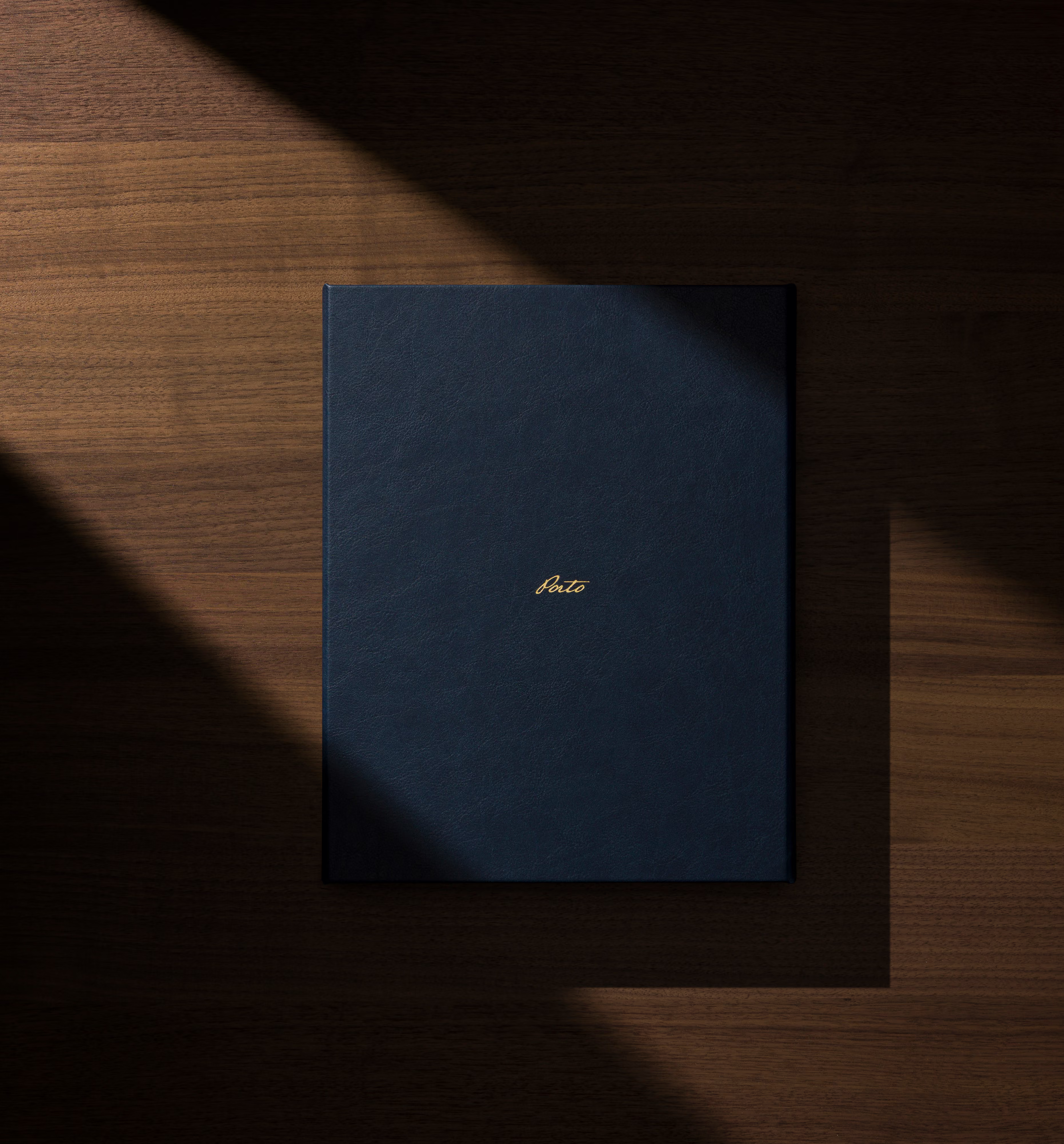
The physical collateral was conceived as a curated collection rather than a single brochure. Carefully selected papers, bespoke finishes, hand-applied elements and stamped details introduce variation across each piece, allowing the process of making to remain visible.
The hero brochure sits within a wider suite of publications, with each piece given its own character while remaining connected through colour, typography and material.
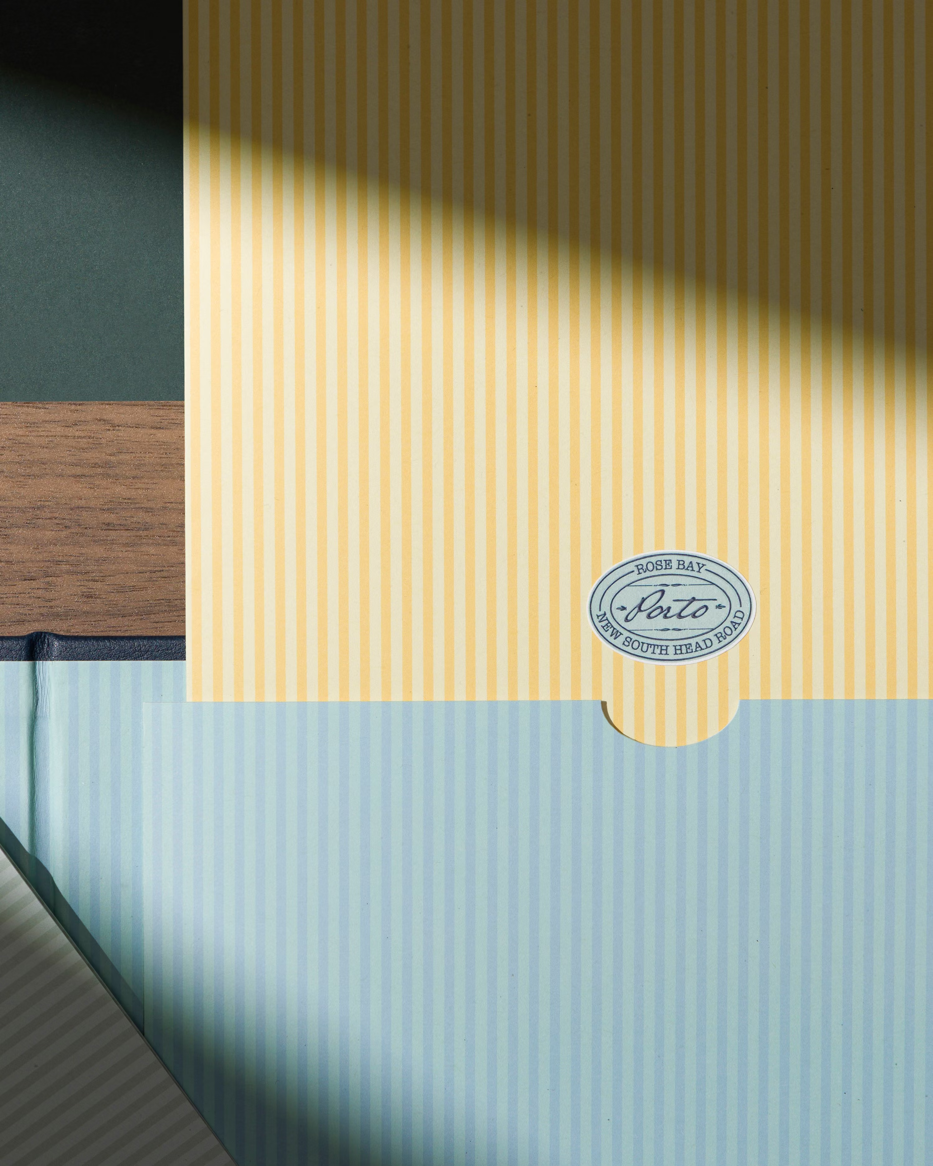
Hand-applied details introduce a degree of idiosyncrasy. Rather than pursuing absolute uniformity, we embraced the subtle variations that come with the human hand, creating a physical expression of Porto's relationship between heritage, craft and contemporary design.
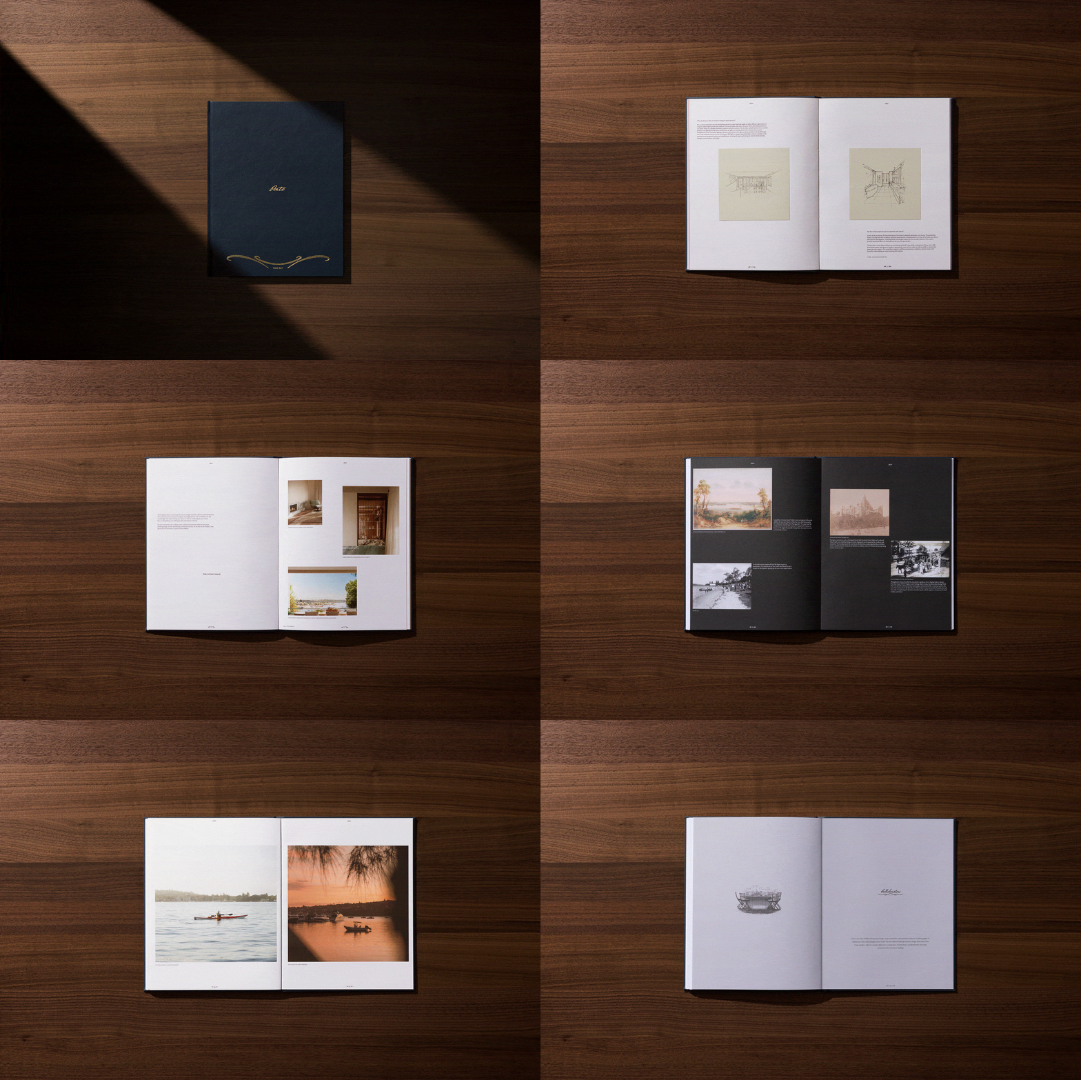
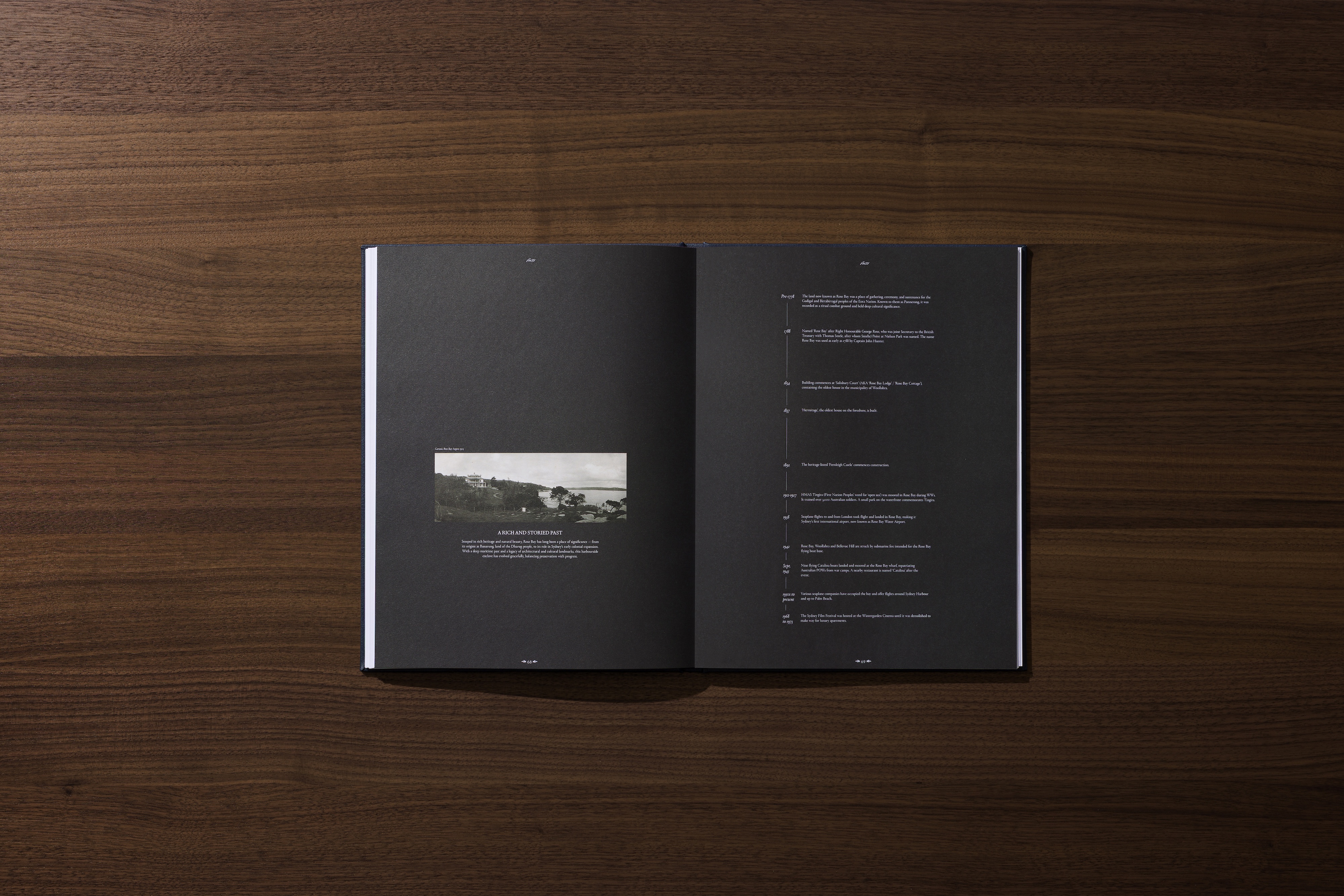
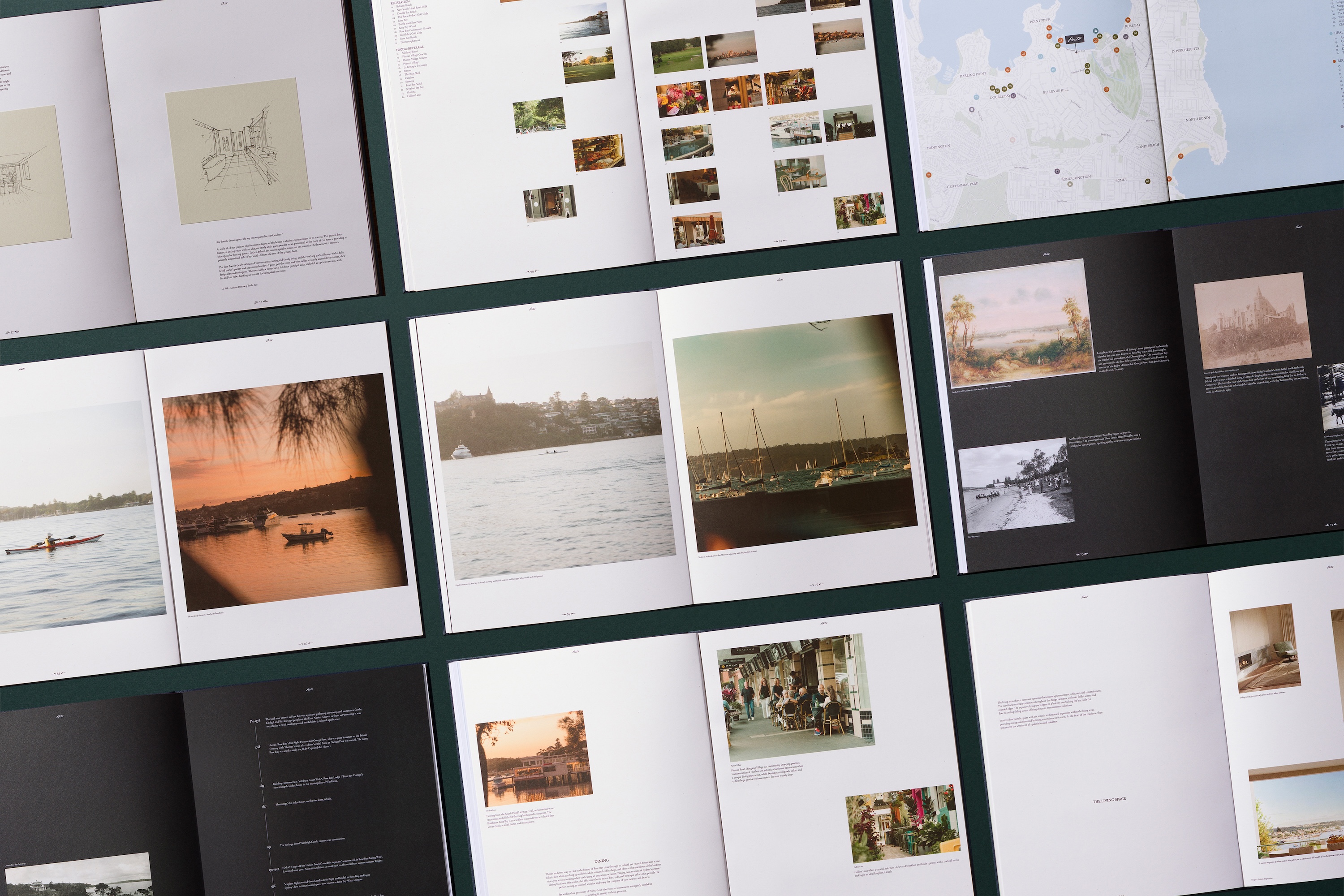
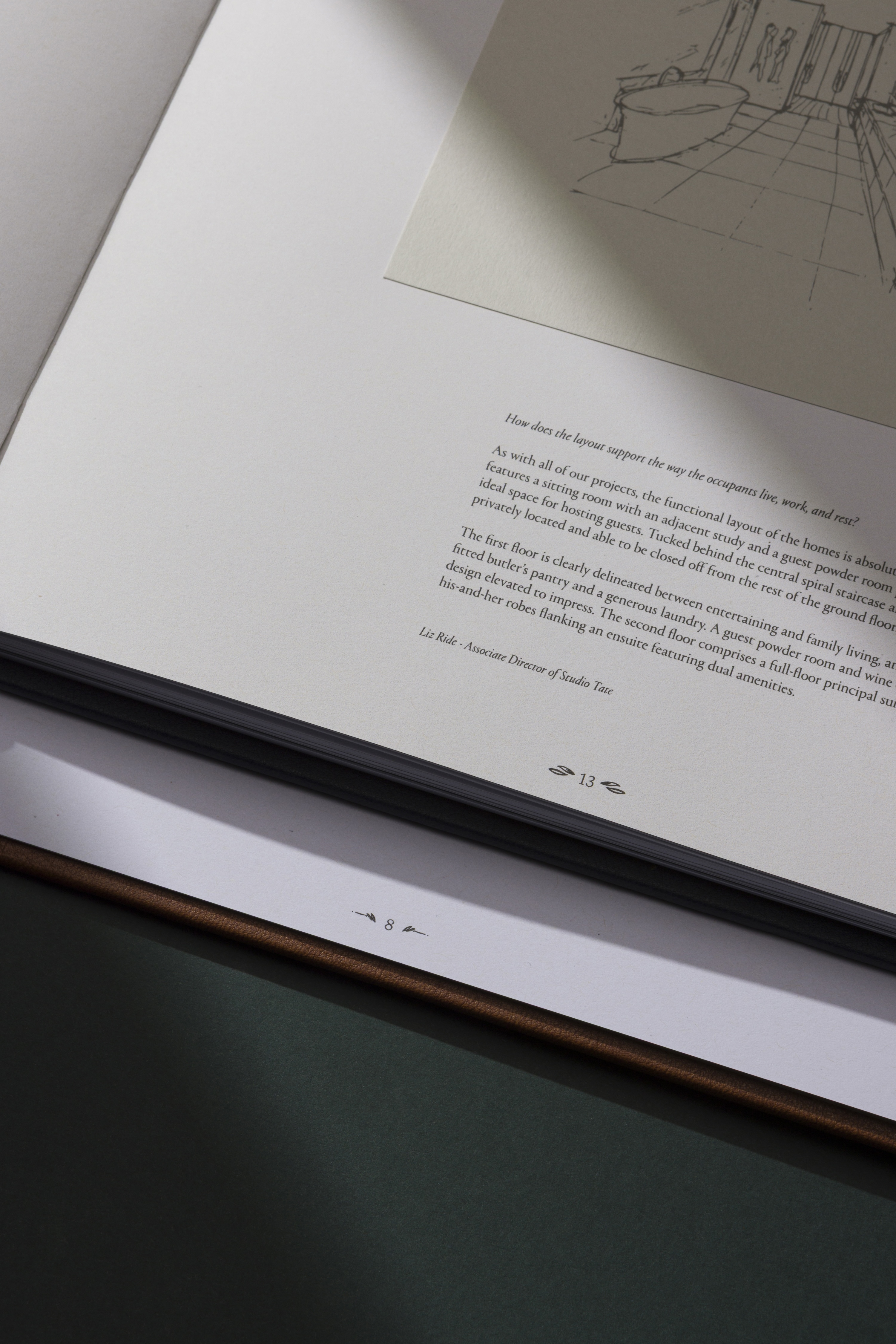
The brochure was structured around rhythm, sequence and the considered release of information.
We translated the spatial qualities of the project into a graphic principle of squeeze and release, moving between moments of compression and openness across the spreads. Shifts in density, scale and negative space create a gentle rhythm through the publication, guiding the reader without imposing a rigid structure.
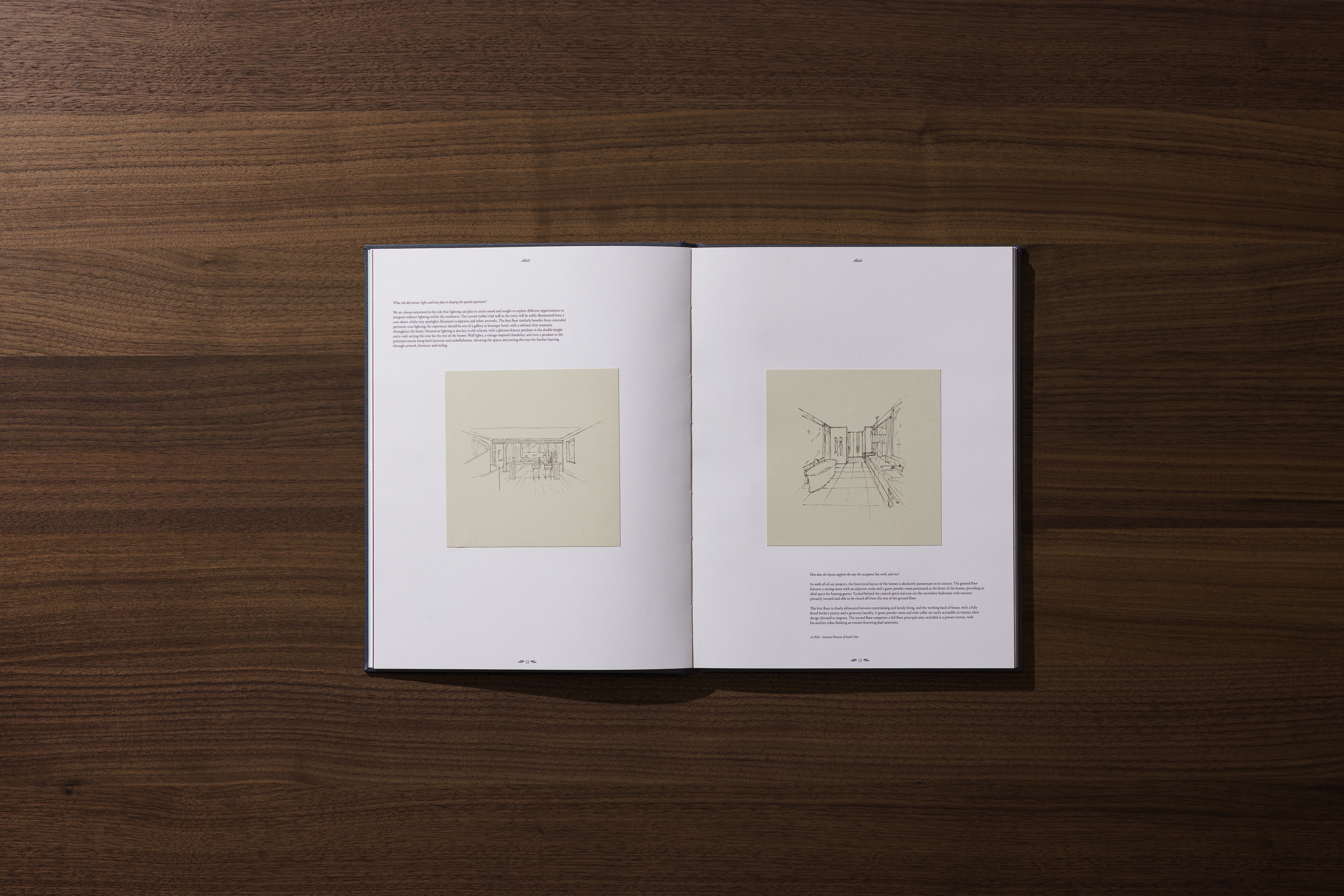
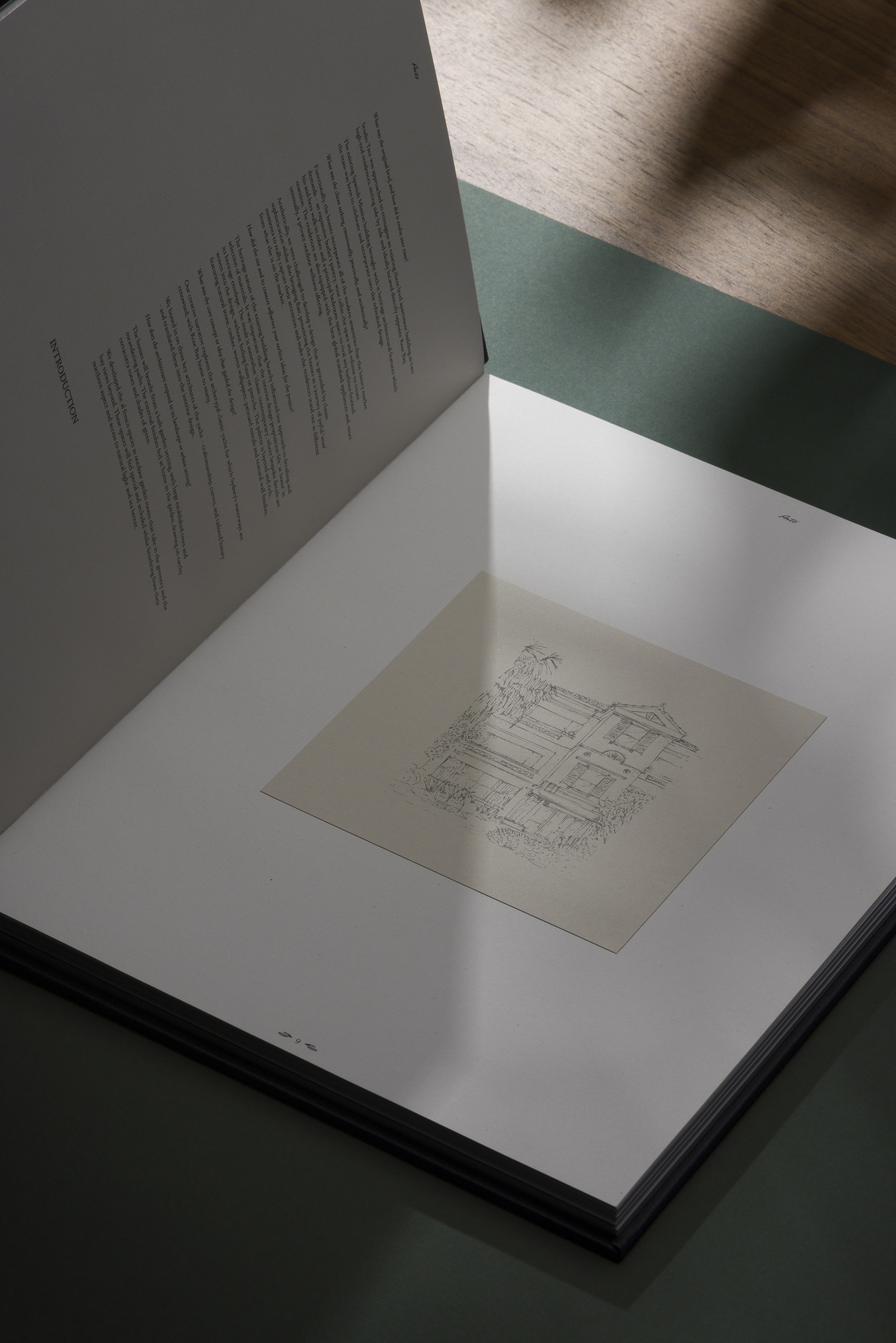
Imagery, typography and editorial content build and recede throughout the sequence, while architectural sketches and hand-drawn elements introduce a more personal layer.
The result is a publication that moves between the polished and the handmade, with each spread contributing to a larger narrative.
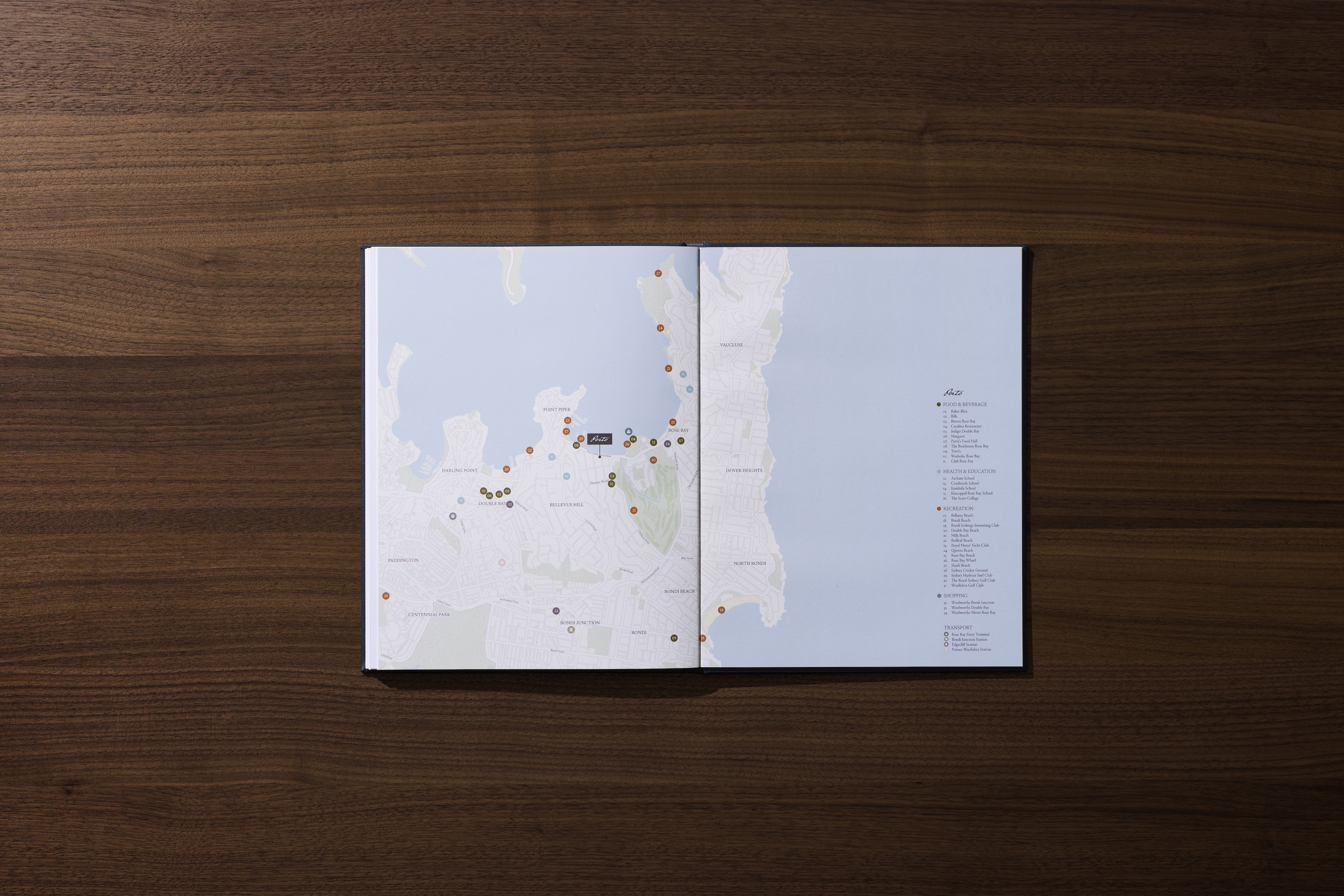
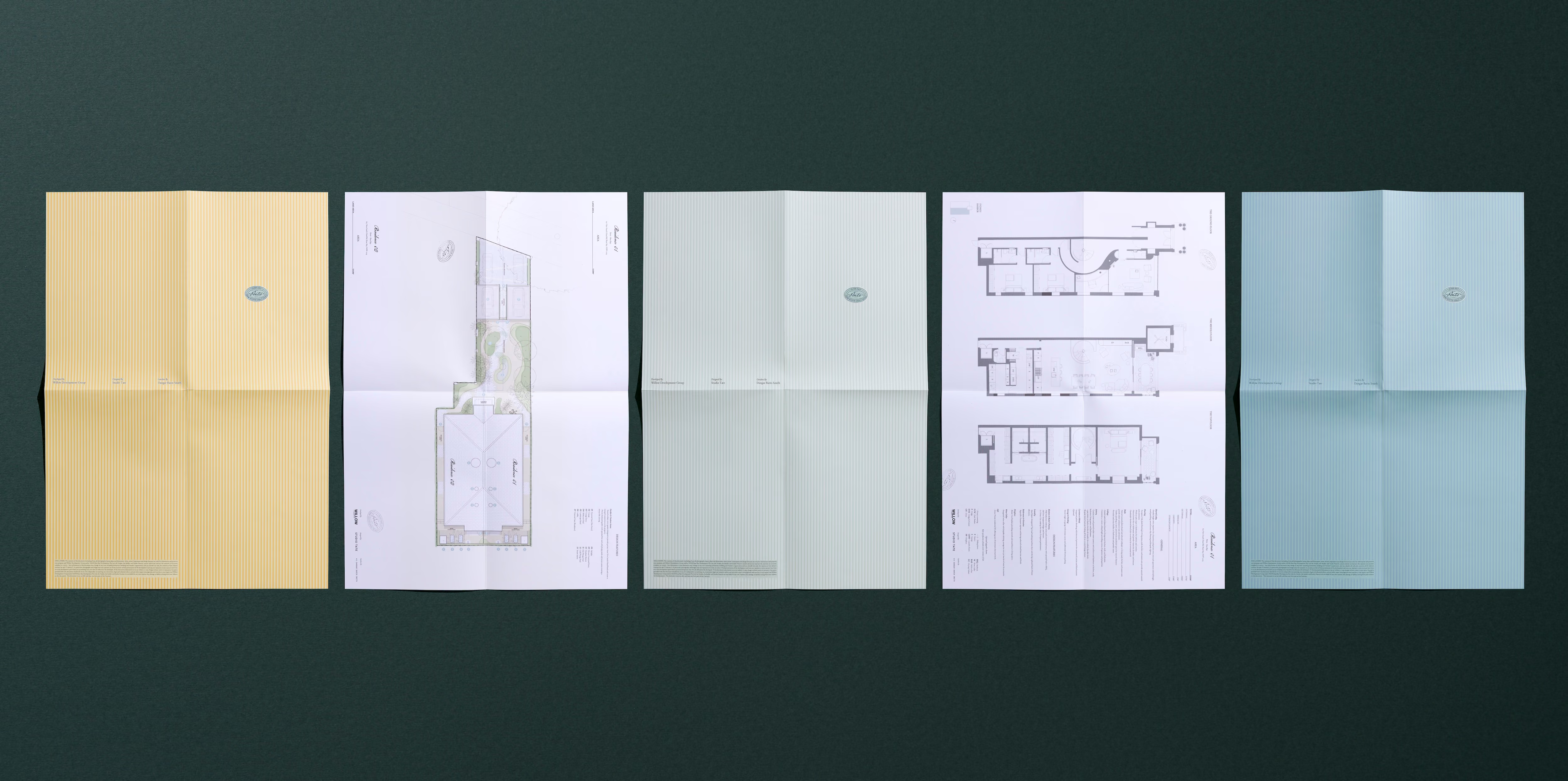
The floorplans were integrated into the individual brochures as considered objects in their own right.
Rather than separating technical information from the broader publication, the plans form the end pages of each book, distinguished through individual colour treatments and hand-applied details.
Hand stamping introduces an intentional sense of variation, making each brochure part of a limited collection. The process remains evident rather than concealed, reinforcing the idea that craftsmanship exists not only within the finished architecture, but within the way the project is communicated.
Precision is softened by the human hand, creating a more tactile relationship with information.
Porto's identity was developed as a collection of connected expressions rather than a fixed graphic system.
Hand-drawn architectural sketches, illustration, moving images and recurring graphic motifs create different points of entry into the project while maintaining a consistent visual language.
The sketches offer a glimpse into the architectural process, introducing an unfinished quality into an otherwise highly resolved collection of collateral. Video extends this language into motion, bringing rhythm and movement into the digital experience.
The balance between polished and process-led gives the identity room to evolve across different formats and touchpoints.
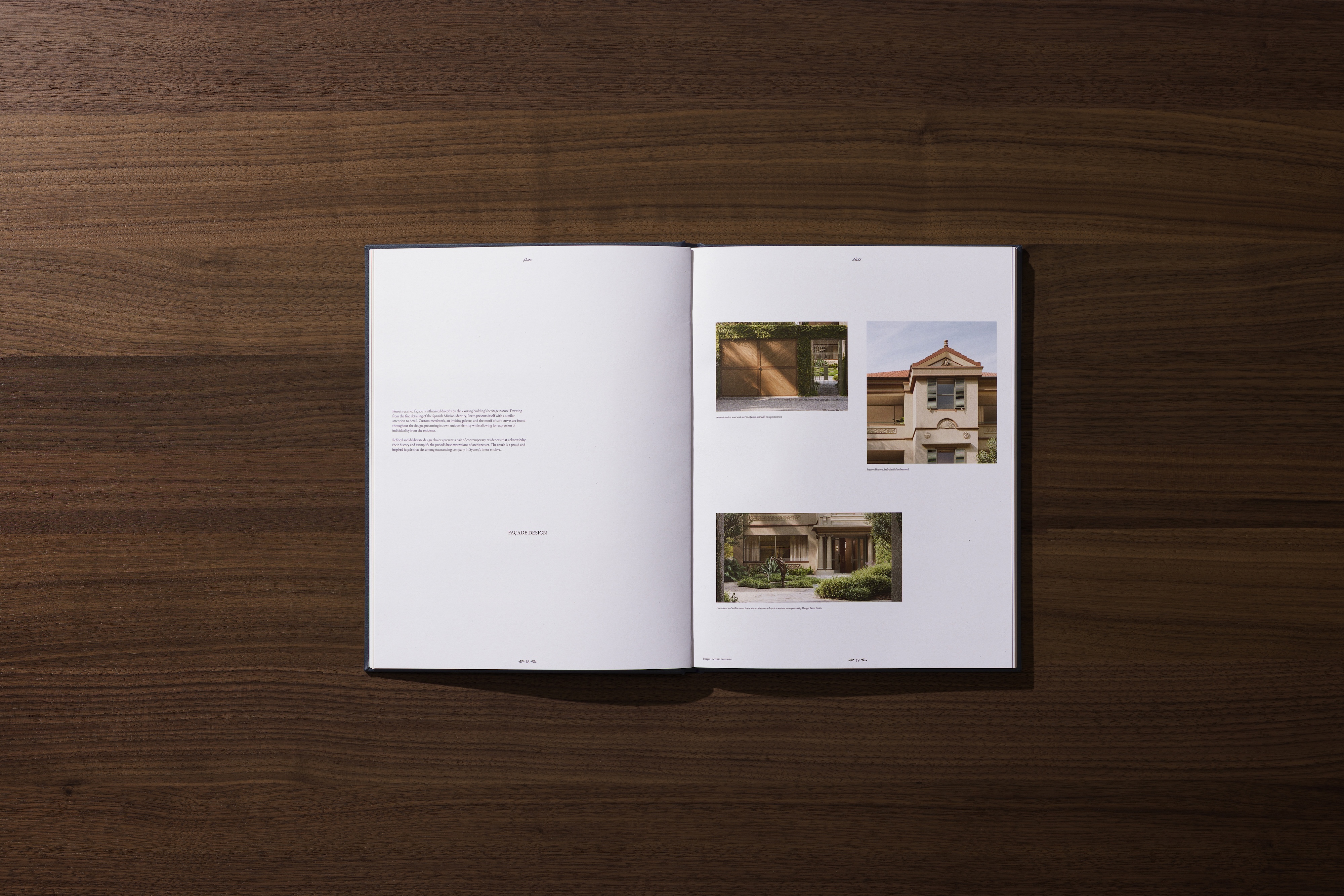
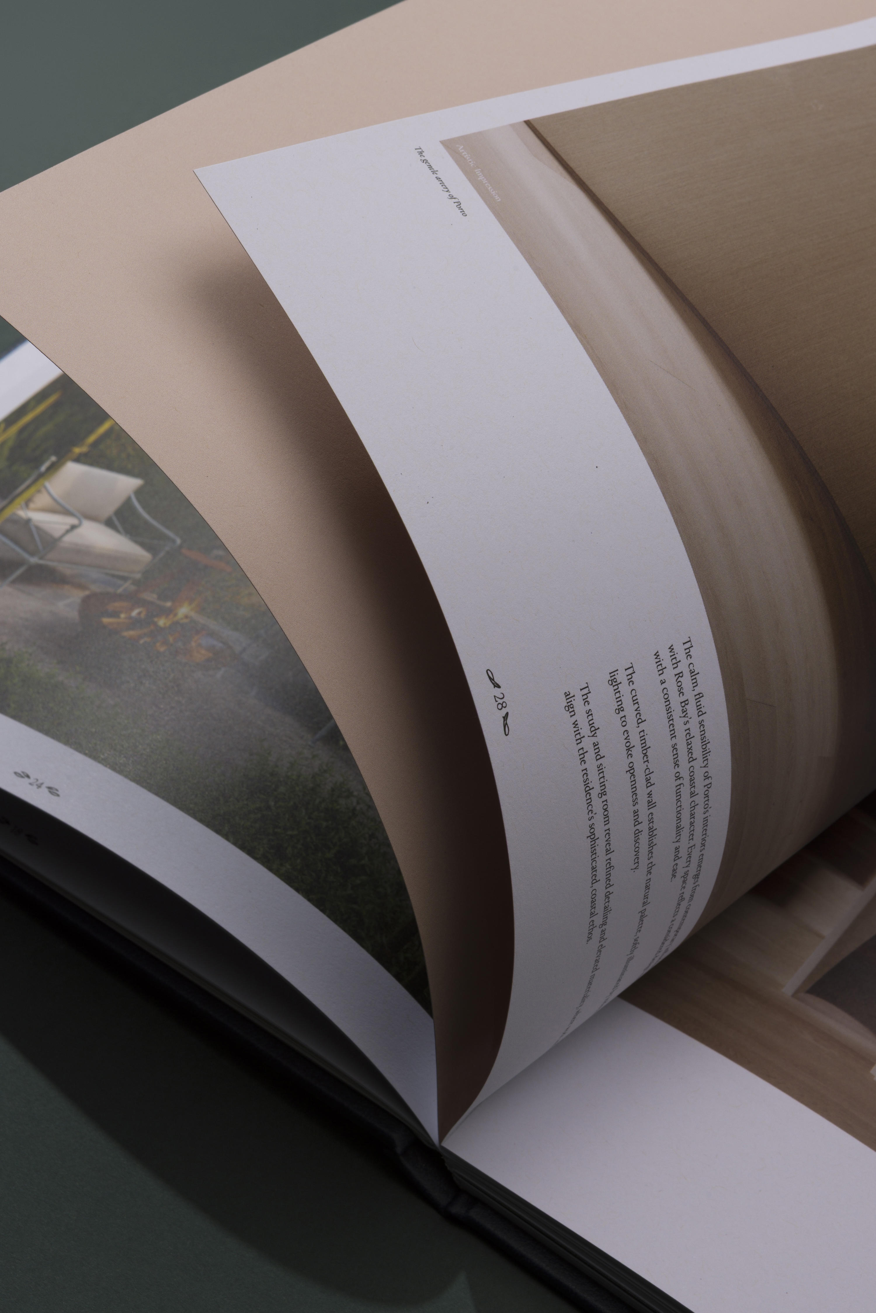
The architectural renders balance the ease of coastal living with the timeless character established by Porto's setting.
Warm interiors, natural materials and carefully composed spaces create a palette connected to Rose Bay without relying on the familiar visual language of beachside property.
We treated the renders as part of the editorial narrative, allowing imagery to breathe across the publication and giving individual spaces room to establish their own character.
Material junctions, finishes, light and proportion are given the same consideration as the broader architectural view. The result is an image-making approach where atmosphere and detail carry equal weight.
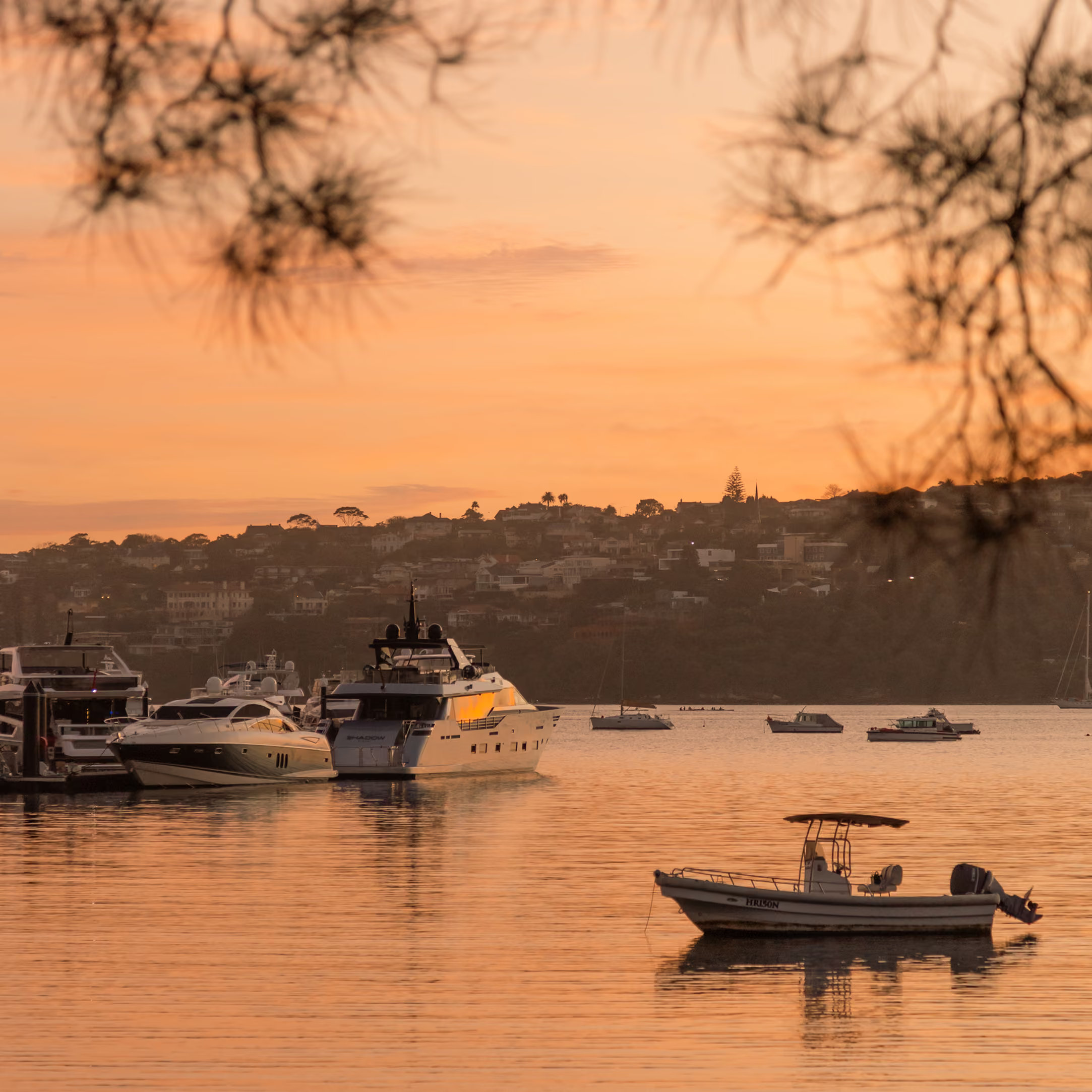
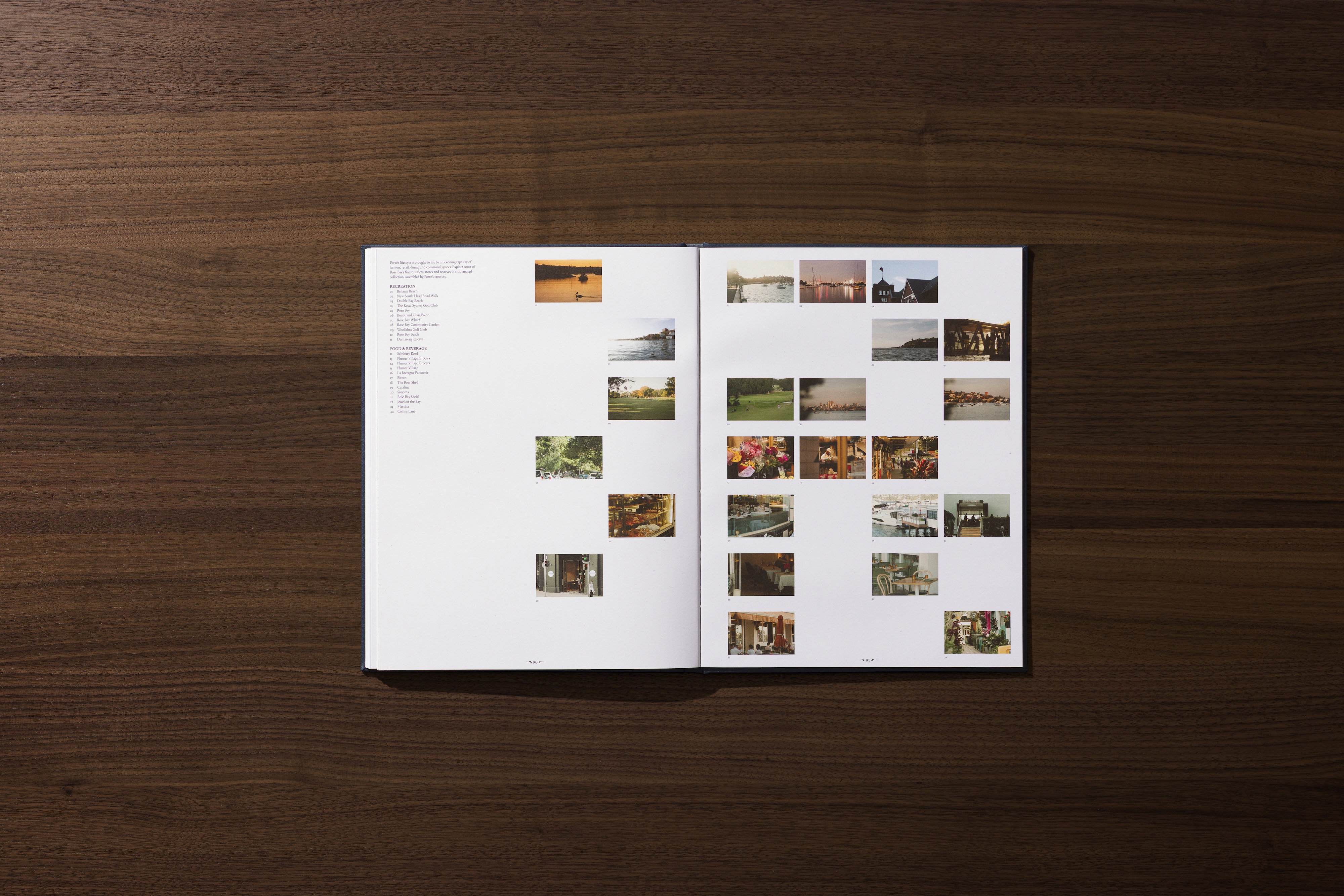
Photography provides another reading of Porto, moving beyond the residences to capture the character and lifestyle of Rose Bay.
The imagery looks to the quieter rhythms of the area: coastal walks, local streets, dining, greenery and the everyday moments that give the neighbourhood its distinct sense of place.
Rather than relying on familiar tropes of beachside living, the photography builds a more nuanced portrait of Rose Bay through atmosphere, light and detail. Broader scenes are balanced with more intimate observations, creating a sense of movement through the neighbourhood.
Together, the imagery positions Porto within the tangible lifestyle of Rose Bay, creating a visual narrative that feels collected rather than staged.
Across print, digital, photography and moving image, we were determined to create an identity grounded in the relationship between heritage, craftsmanship and contemporary coastal living.
Materiality and hand-applied detail give the brand a physical presence, while the principle of squeeze and release establishes rhythm across the editorial experience. Photography, illustration and moving image broaden the identity beyond the brochure, creating a system with enough structure to remain cohesive and enough character to evolve.
Porto becomes more than a property identity. It becomes an expression of place, process and the quieter art of contemporary living.
Scope:
Collaborators:
Willow Group (Developer)
Studio Tate (Architect)
Studio Piper (Renders)
WorkWorks (Printer)
- Lifestyle Photography