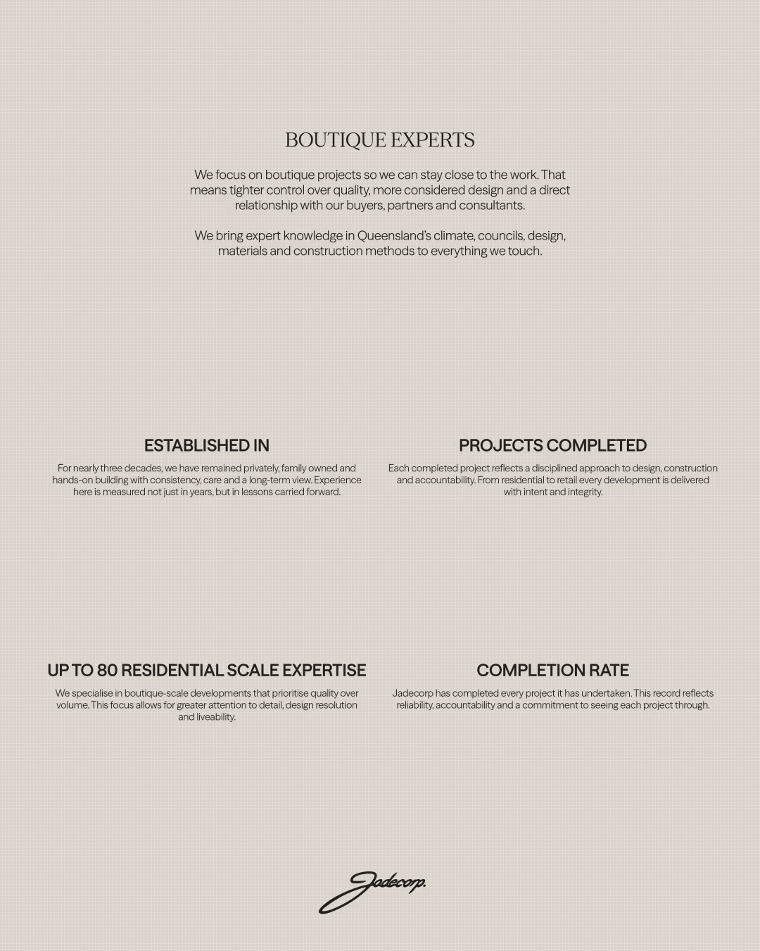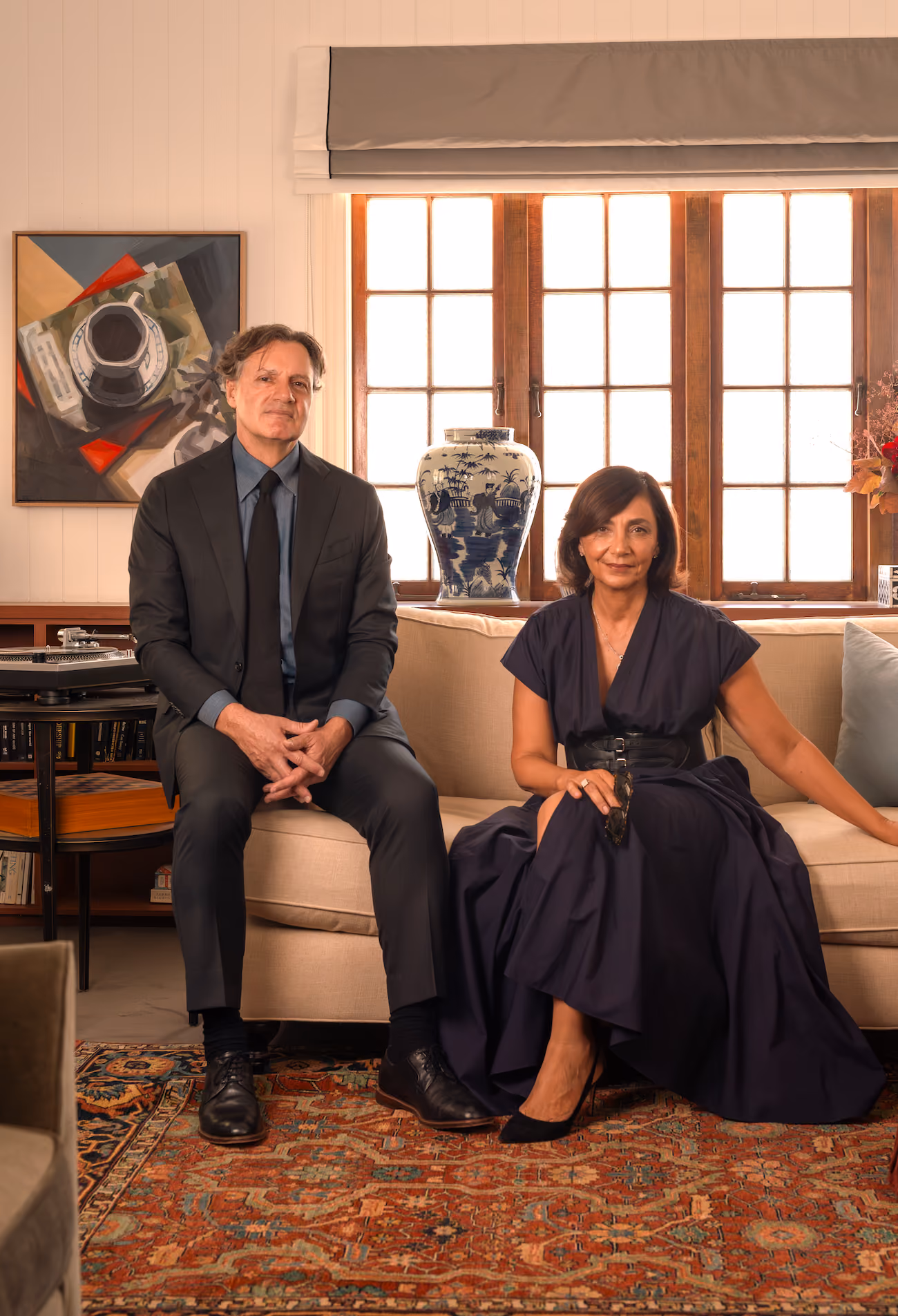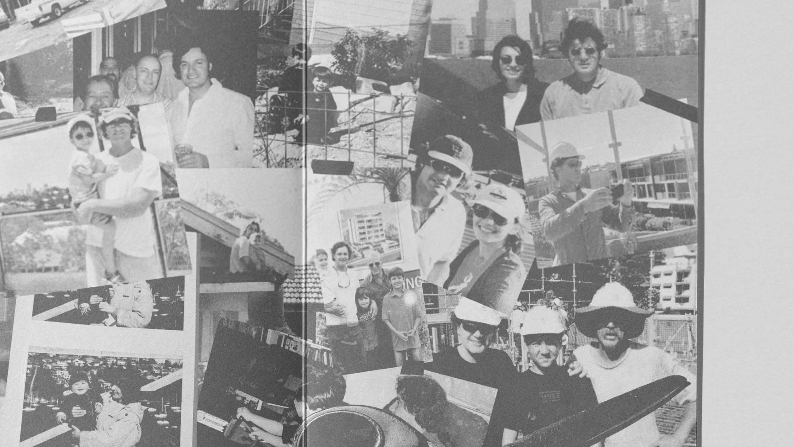
Jadecorp is a Queensland-based developer and builder that has been instrumental in contemporary urban living since 1997. Family-led and privately owned, the business has built a reputation for delivering thoughtfully designed residences that balance people, place and process across every stage of development, from concept through to completion. Combining the professionalism of an industry-leading organisation with the care, accountability and integrity of a family business, Jadecorp has become recognised for its disciplined approach to development, enduring quality and deep connection to Queensland living.
Studio Nascent partnered with Jadecorp to lead a complete brand overhaul to reposition the business as a principled leader within the next generation of Queensland architecture and urban living. The project centred on creating a brand identity and tone of voice that felt grounded, assured and deeply connected to place: one that could reflect Jadecorp’s long-standing heritage while confidently advancing its future vision.
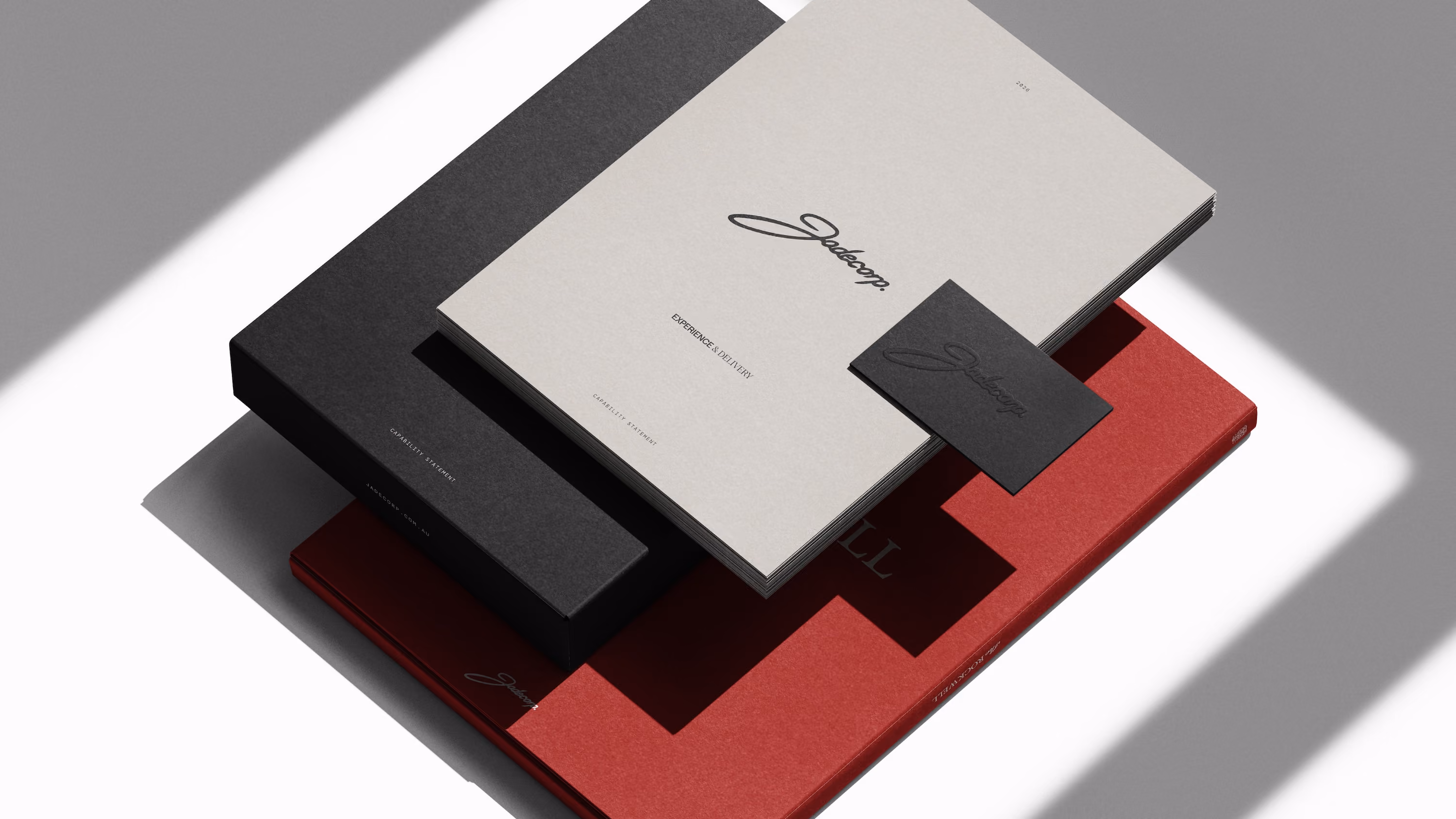
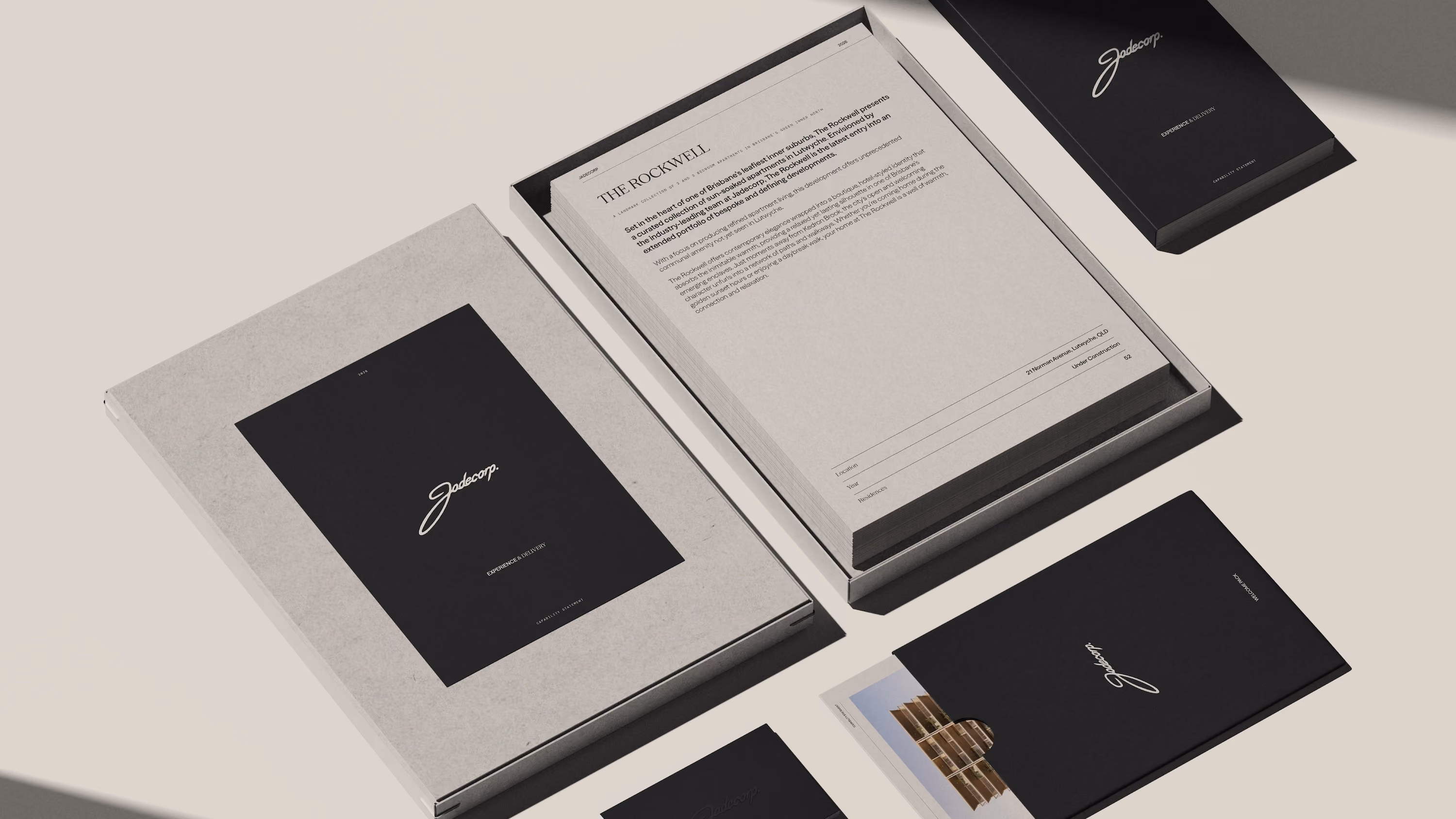
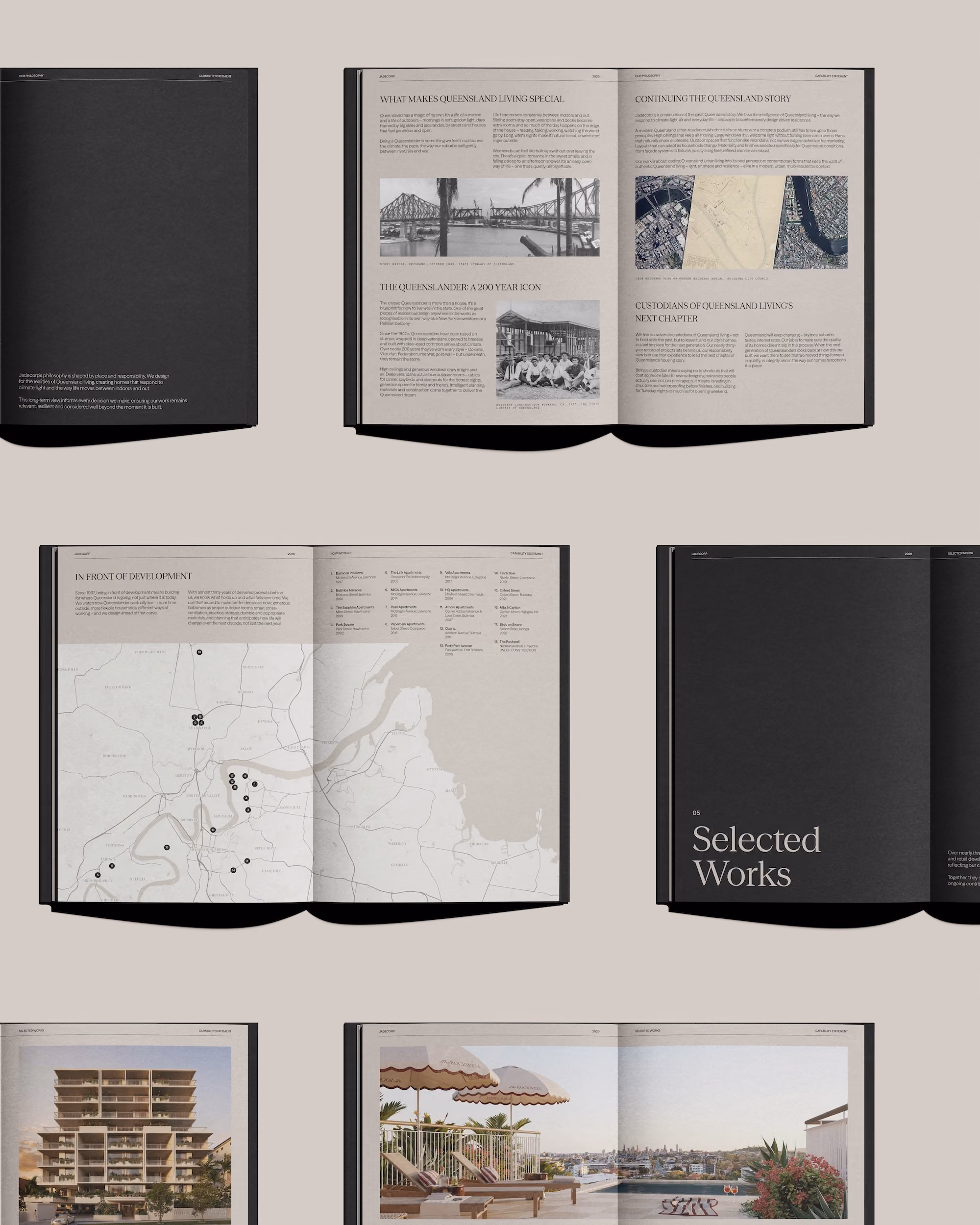
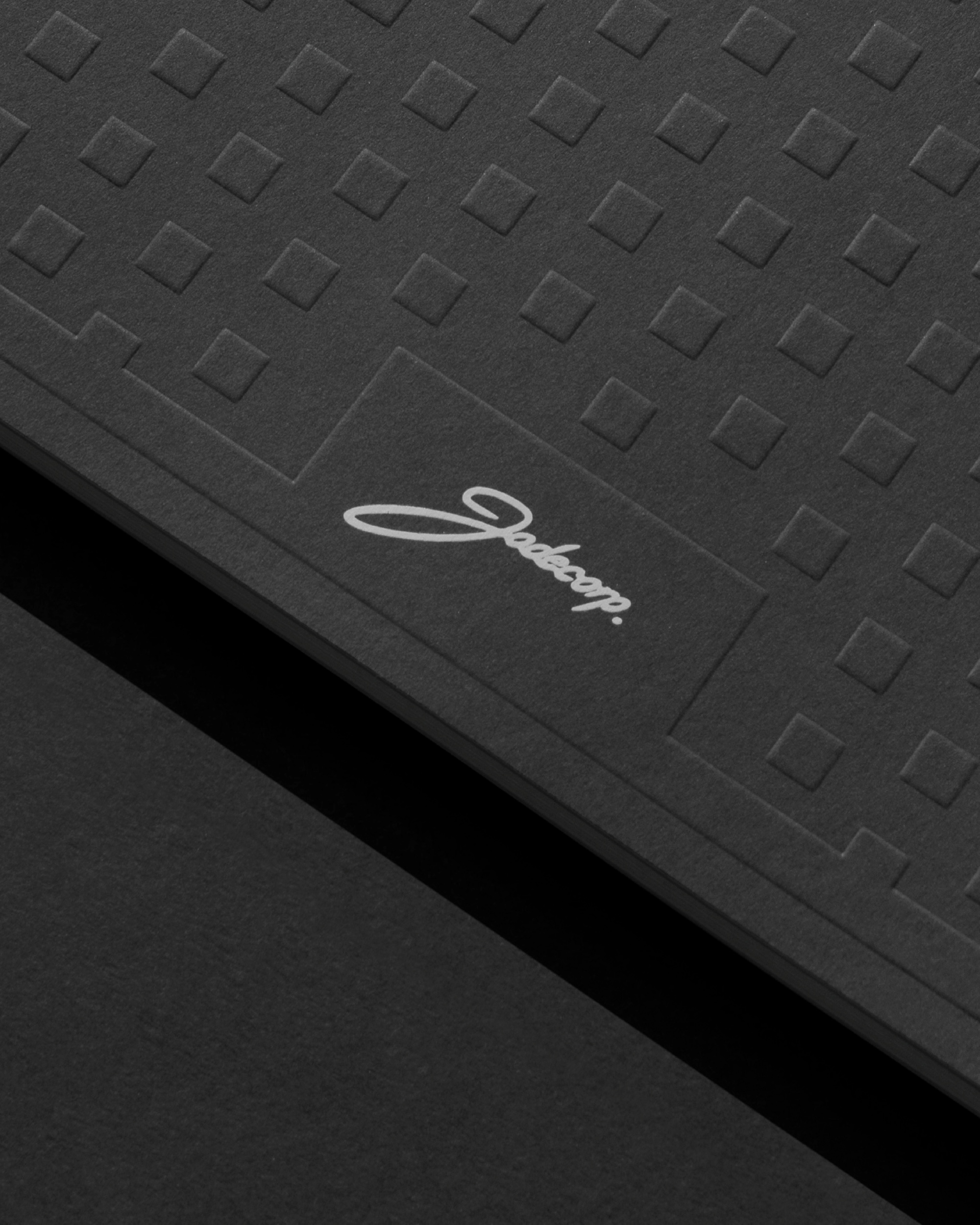
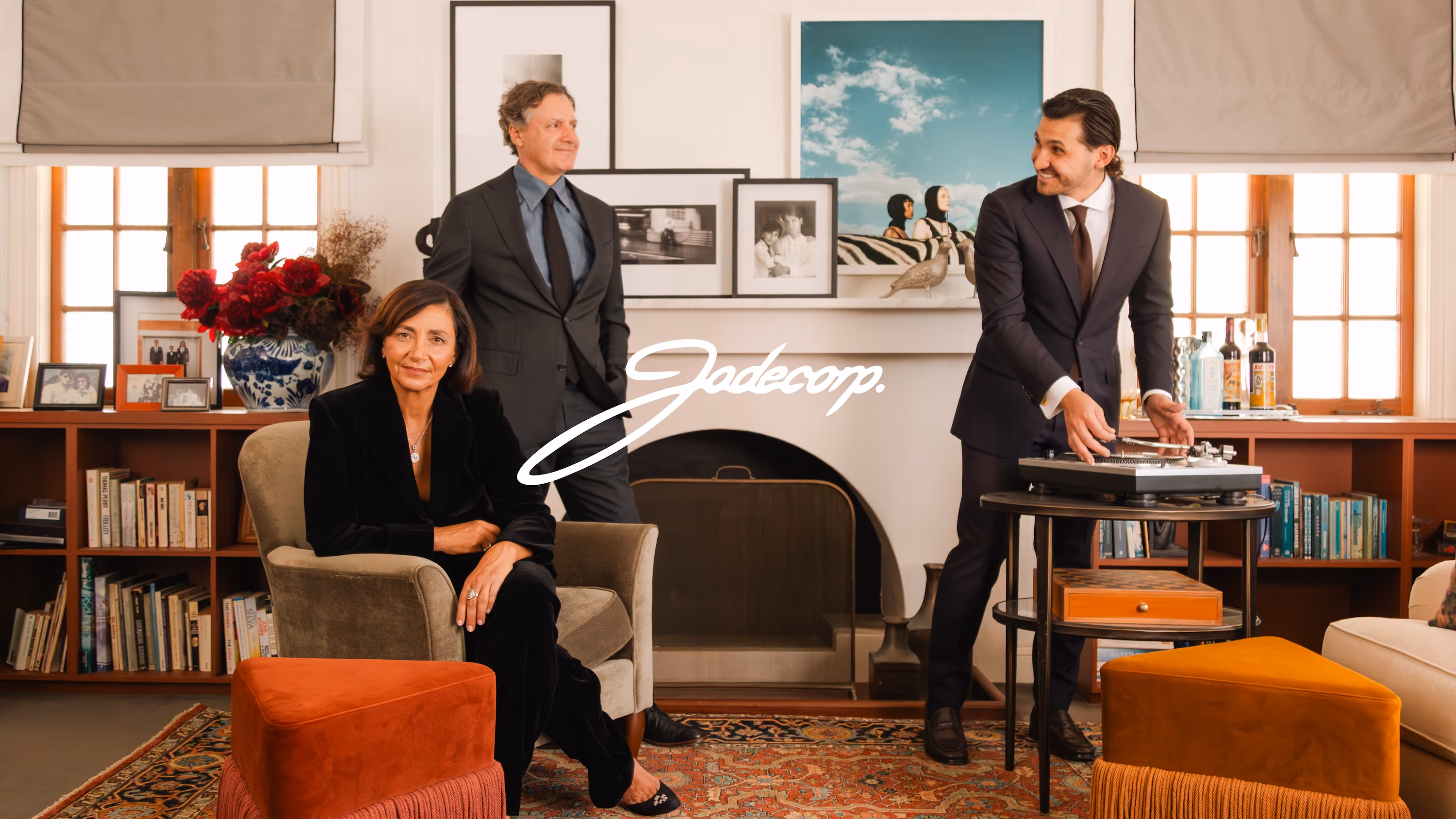
The identity system was approached with restraint, clarity and a confidence that emulates the brand’s timeless flair. Central to the visual language is the handwritten Jadecorp logo, a script mark that references the company’s family-led foundations and hands-on approach. The mark feels personal and authentic while remaining refined and enduring, balancing warmth with professionalism. Rather than pursuing overtly corporate aesthetics, the identity was designed to communicate trust, longevity and human-centred thinking.
This philosophy extended into the broader visual system. A restrained palette of Carbon Black, Dust Grey and pure white creates a minimal yet sophisticated foundation that allows architecture, materiality and imagery to lead the visual experience. The simplicity of the palette reinforces discipline, permanence and confidence, supporting the brand without overwhelming it.
Typography further reinforces this balance between heritage and contemporary refinement. The pairing of Season Sans SemiBold and Season Serif Regular combines precision with softness, creating an editorial tone that feels elevated, grounded and distinctly aligned with the future of Queensland living. Together, these elements establish a visual identity that feels both timeless and forward-thinking.
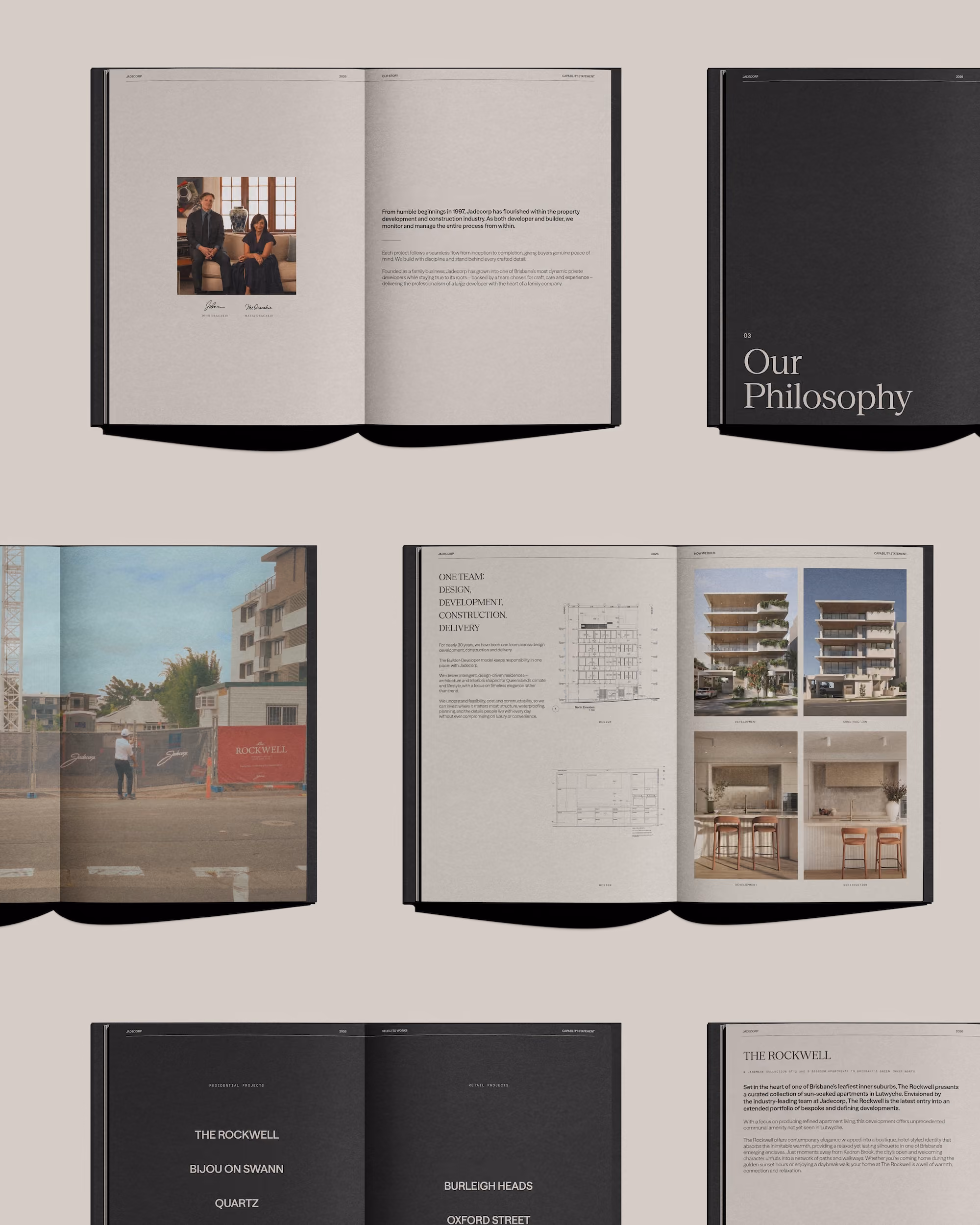
Photography and videography became equally important components of the project, shaping the emotional character of the brand. Studio Nascent approached imagery with a focus on permanence, restraint and thoughtful storytelling. Every photograph was carefully composed to reflect family, legacy and longevity while balancing contemporary architecture with authentic lifestyle moments. Warm, natural editing preserves texture and atmosphere, ensuring the work feels enduring rather than trend-driven.
For video, the direction remained calm and observational. Locked-off compositions behave like moving photographs, allowing subtle moments (shifting light, moving curtains and everyday life within the space) to create atmosphere and narrative. Rather than relying on overtly promotional techniques, the films focus on texture, patience and lived experience, revealing how Jadecorp homes are meant to be experienced over time.
Across every touchpoint, curation became central to the identity system. From materiality and framing to pacing and narrative, every decision was made to reinforce Jadecorp’s disciplined, human-centred approach to development. The result is a cohesive brand world that honours Queensland’s architectural heritage while positioning Jadecorp as a thoughtful and enduring contributor to its future.
Scope: